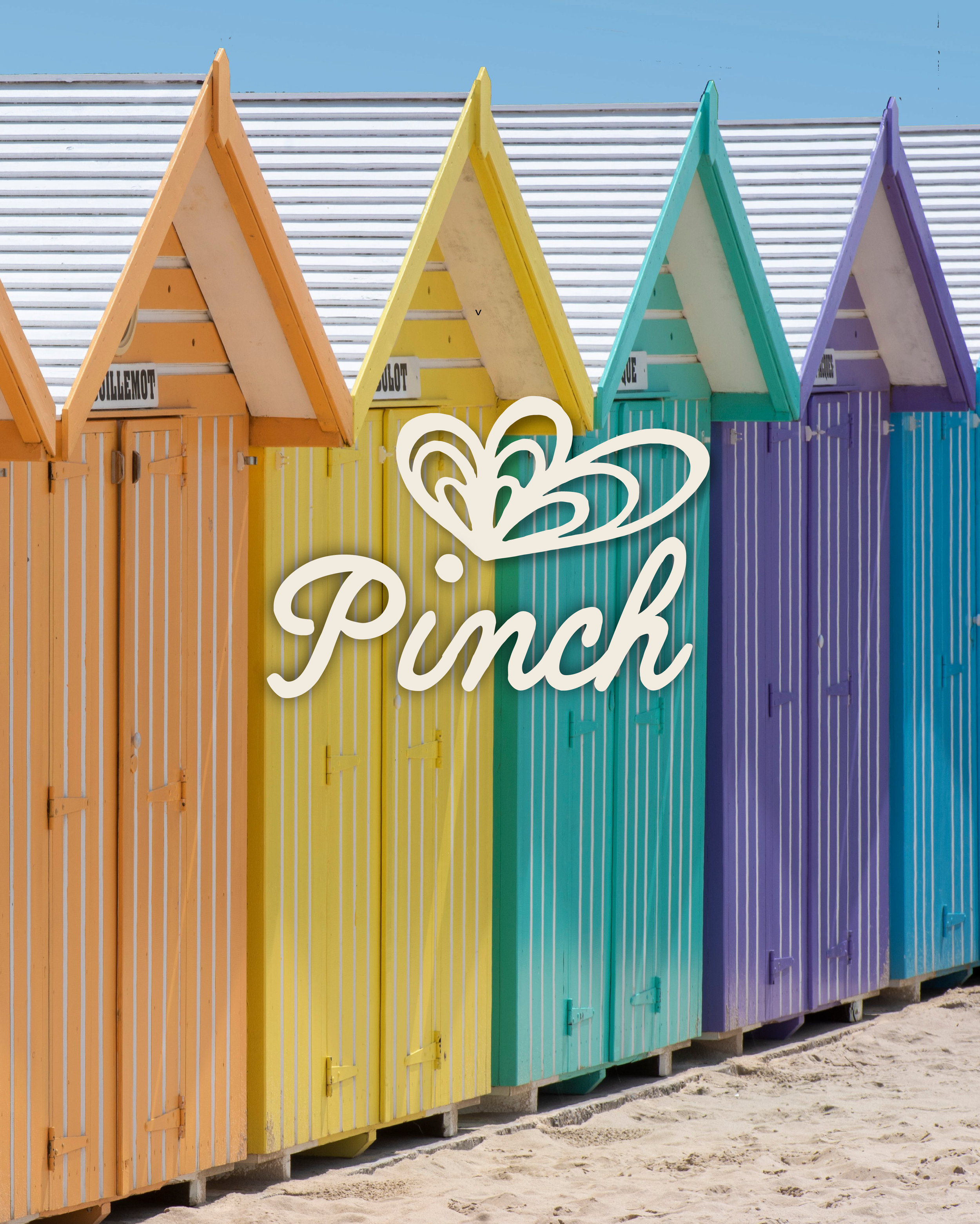
Meet Pinch: The Concept Brand That Started With a Cute Crab on Procreate
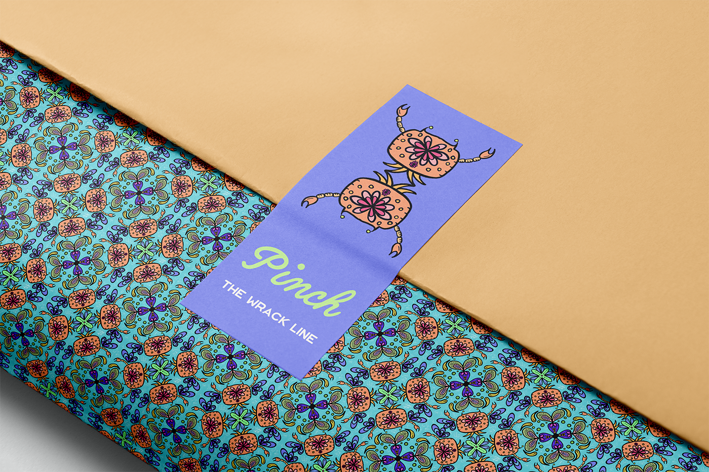
Wrapping and label design for Pinch.
So this one started completely by accident.
I was messing about on Procreate one evening, just doodling, and drew a cute little crab. That crab then turned into a pattern. The pattern got coloured in. And then, somewhere between "ooh that looks nice" and eleven o'clock at night, I had a full concept brand on my hands. I couldn't let the little crabby go, so I just kept going.
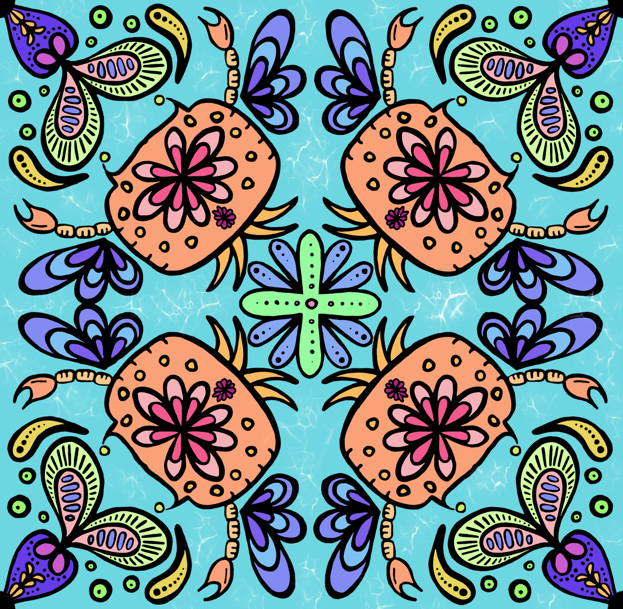
The original Procreate illustration.
That's how Pinch was born: a seaside-inspired concept brand identity for a fictional natural soap range, dreamed up over one weekend of proper hyperfocus.
Where the Pinch brand identity came from
I'm not usually drawn to bright, punchy colours in my work. My style tends to lean more muted and earthy. But this was a personal project with no client brief and no rules to stick to, so I let myself run wild with colour for once, and I loved every second of it.
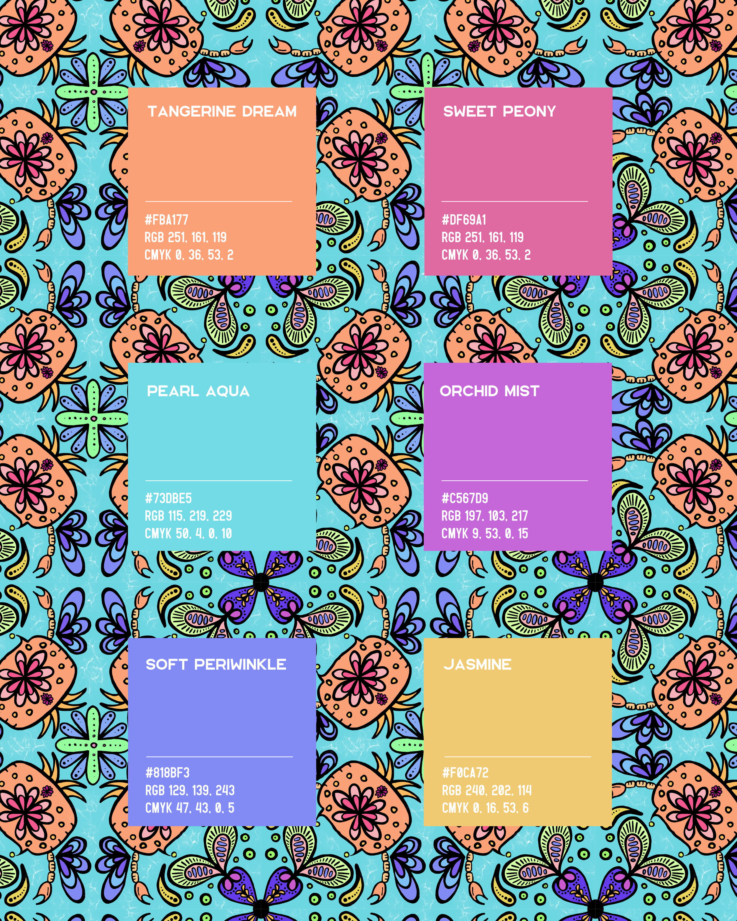
The final colour palette for Pinch.
The whole palette for Pinch was pulled straight from that original hand-drawn pattern: tangerine dream, sweet peony, pearl aqua, orchid mist, soft periwinkle and jasmine. Bright, beachy, and completely unlike anything else in my portfolio, which is exactly why it was such a fun one to design.
I tried out a few different name ideas before landing on Pinch. As soon as I paired it with the crab illustration, it just clicked. Sometimes a brand name earns its place through personality rather than logic, and Pinch has bags of personality.
Bringing the Pinch soap packaging to life
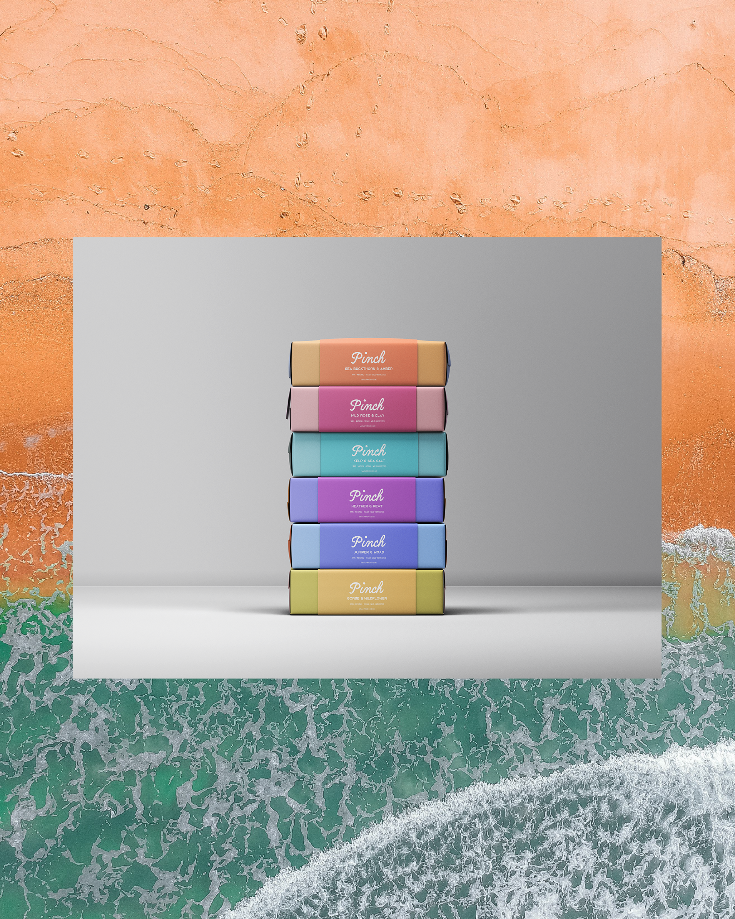
Pinch stacked soap mock up
Once the name and palette were locked in, I built the whole thing out as a fictional bar soap range called The Wrack Line, four natural, vegan, wild harvested soaps stacked together with scent names like Sea Buckthorn & Amber, Wild Rose & Clay, Kelp & Sea Salt, and Heather & Peat.
I illustrated the sea buckthorn myself too, which felt like a nice way to tie the botanical details back into the same hand drawn world as the crab.
Designing the packaging mock-ups, from the soap box itself through to the wrapping paper and belly bands, was where the concept really came together as a proper brand rather than just a nice pattern. Little details like the mini crab badge on the box wrap and the pattern continuing onto the tissue paper made it feel like a brand that could genuinely exist on a shelf somewhere.

Soap label design for Pinch - Sea Buckthorn & Amber
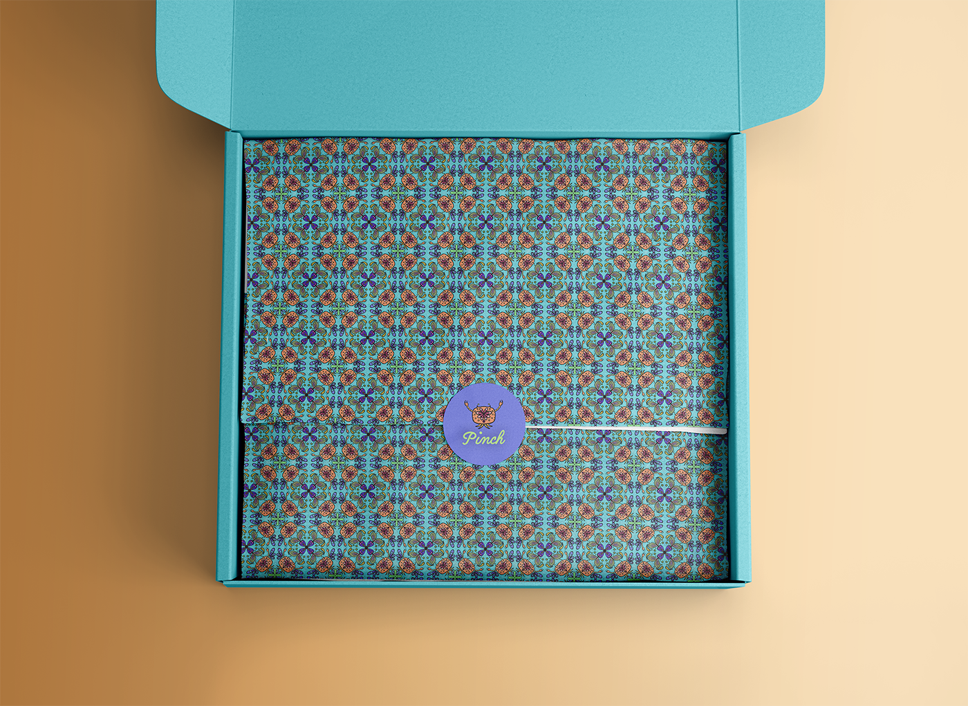
Wrapping and box design for Pinch
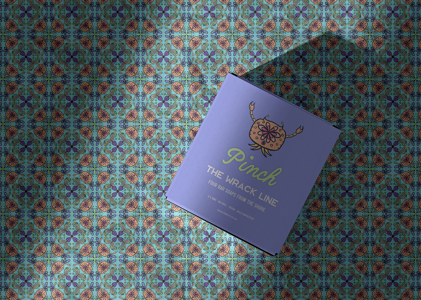
Front of box design for Pinch
Why the sea, and why now
This one also has a bit of a personal story behind it. After years of being properly scared of the sea, I finally tried snorkelling for the first time on a trip to Costa Brava, and something shifted. I've been a bit obsessed with the sea and everything living in it ever since, so it's no surprise that obsession found its way into a brand concept.
There's something quite fitting about a design process that mirrors the thing it's inspired by too. Pinch started small as one little drawing, and grew into something much bigger the more I let myself explore it, a bit like how I felt about the sea itself once I stopped being afraid of it.
A short video of me living my best snorkeling life in Costa Brava
What's next
Pinch was never meant to be a real, sellable product. It's a concept brand, a bit of a playground project that let me experiment with colour, character illustration, and packaging design outside of client work. But it's already shaping some of the thinking behind my own Wild Mind Studios rebrand, which I'm working on at the moment. Keep an eye out for a first look at one of the new logo variations soon.
If you fancy seeing more concept and personal projects like this one, or you're after a brand identity or web design for your own business, have a browse of my portfolio or get in touch.