Moss & Ember: Designing a Wellness Brand Inspired by Nature
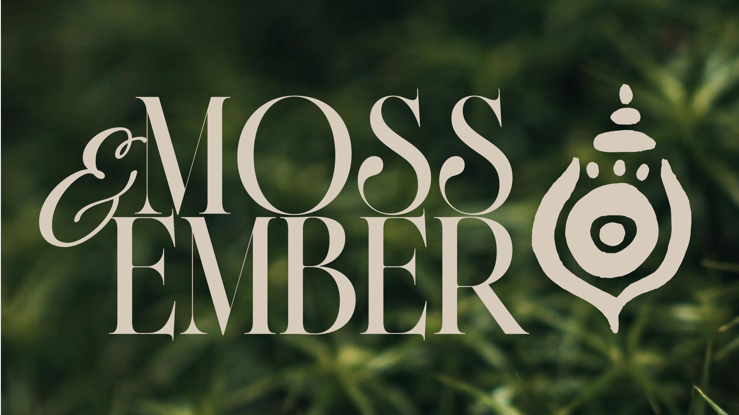
Moss & Ember is a concept brand I made for an imaginary wellness and nature-based lifestyle business that sells candles, rituals and slow-living goods, because after the past few years I’ve been drawn to a slower kind of life and I’m completely obsessed with candles. I was designing a Squarespace website template at the time and needed a brand to build it around, so I decided to create my dream client, the kind of business I’d absolutely love to work with. Nobody asked me to make it, which definitely added to why I loved doing it, because without a client brief I could let my imagination run away and play with ideas I’d love to bring to a real brand one day.
You can see the finished brand on the Moss & Ember portfolio page, but I wanted to share how it came together, because the thinking behind a brand is often the bit people never get to see.
Starting with a feeling
Before I drew anything I wanted to work out how Moss & Ember should feel, and I kept picturing a walk through an old forest, the sort of place where everything slows down and you can smell the earth, so I knew the brand had to feel warm and unhurried and a bit cosy.
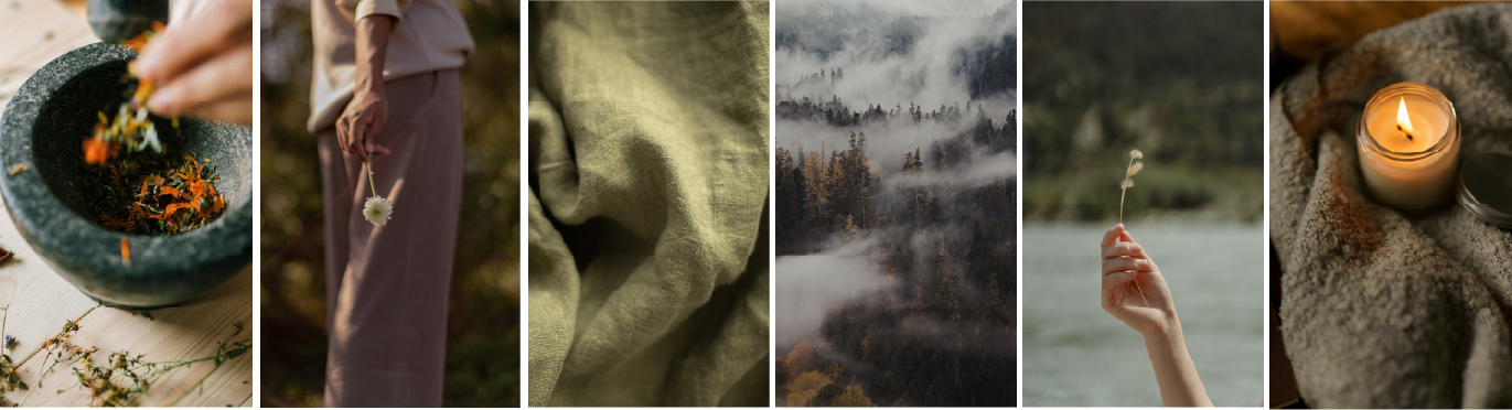
I wanted the colours to have the same cosy feeling, so I went for browns and greens with a bit of that amber, which brought in the Moss and the Ember from the name. When I was creating the mood board and pulling images together for the brand, I centred it around “slow wellness” because I wanted people to feel cosy and like it could be a life they wanted to live, so they were buying into the life and not just the products. So I went to my trusty Pinterest, Cosmos and Pexels and got textures and imagery together, like herbs, linen, misty forests, dried flowers and candlelight, and every time I designed something I looked at the board to see if it still felt like that.
The logo suite
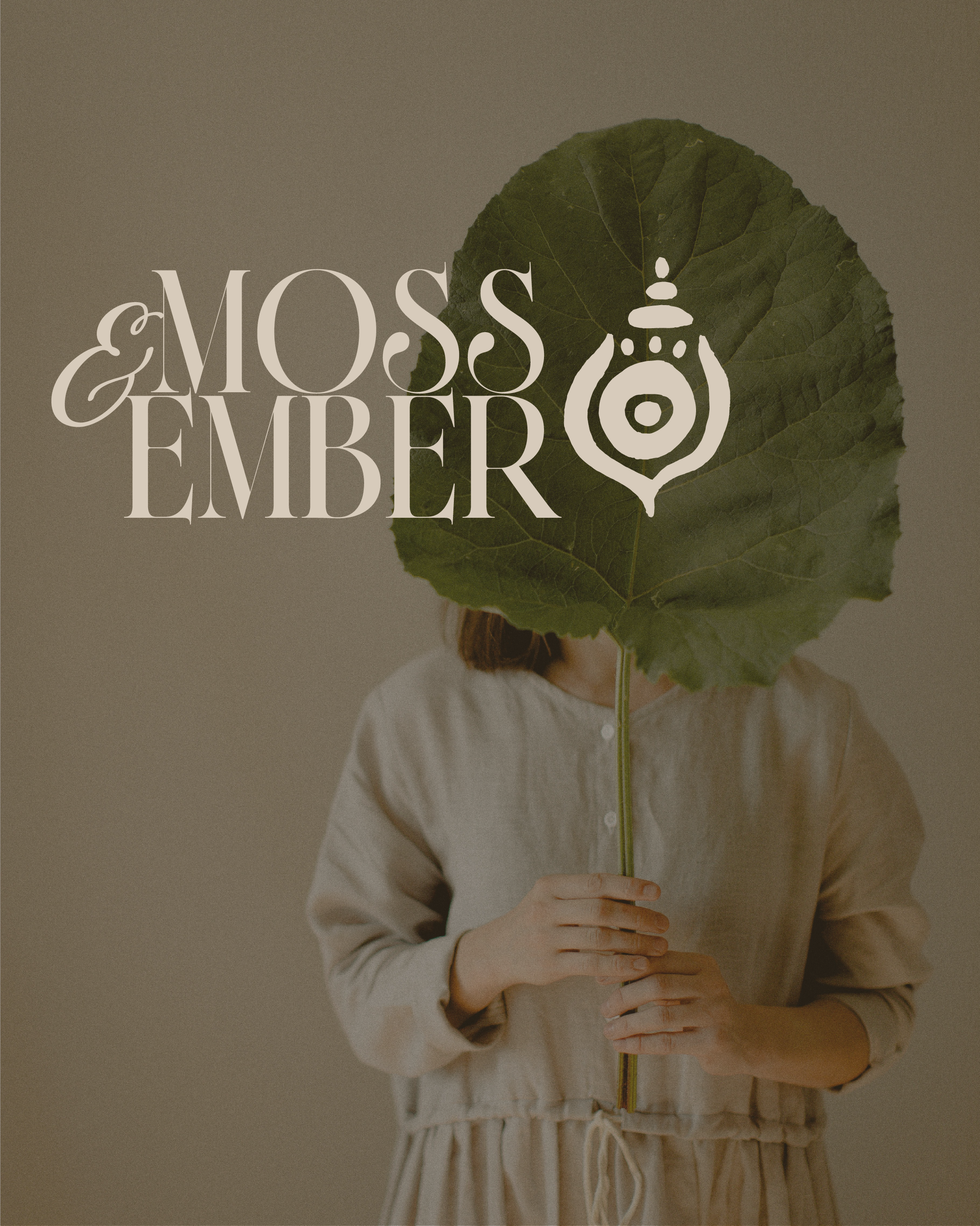
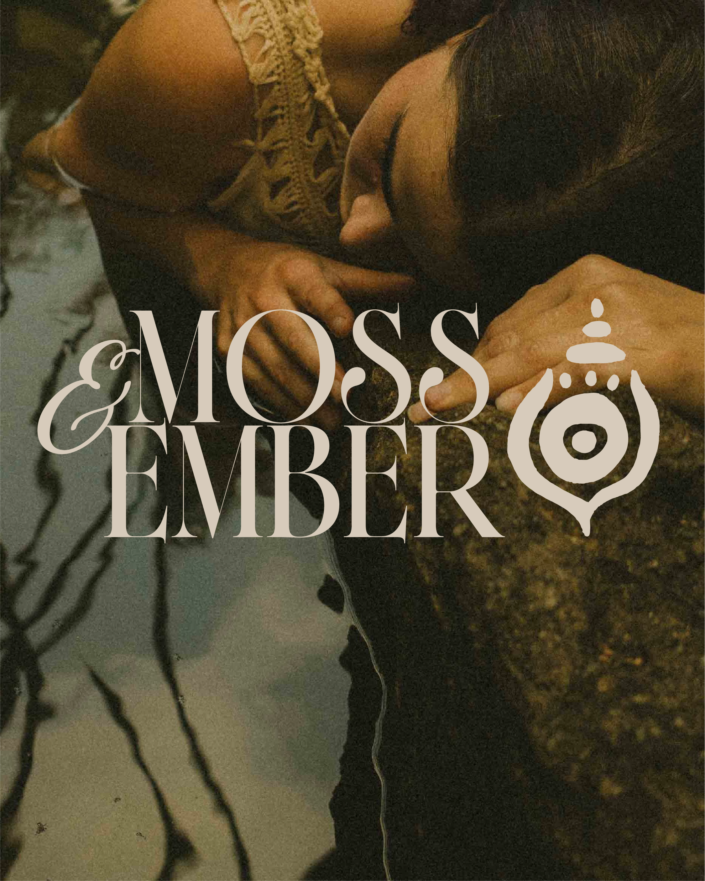
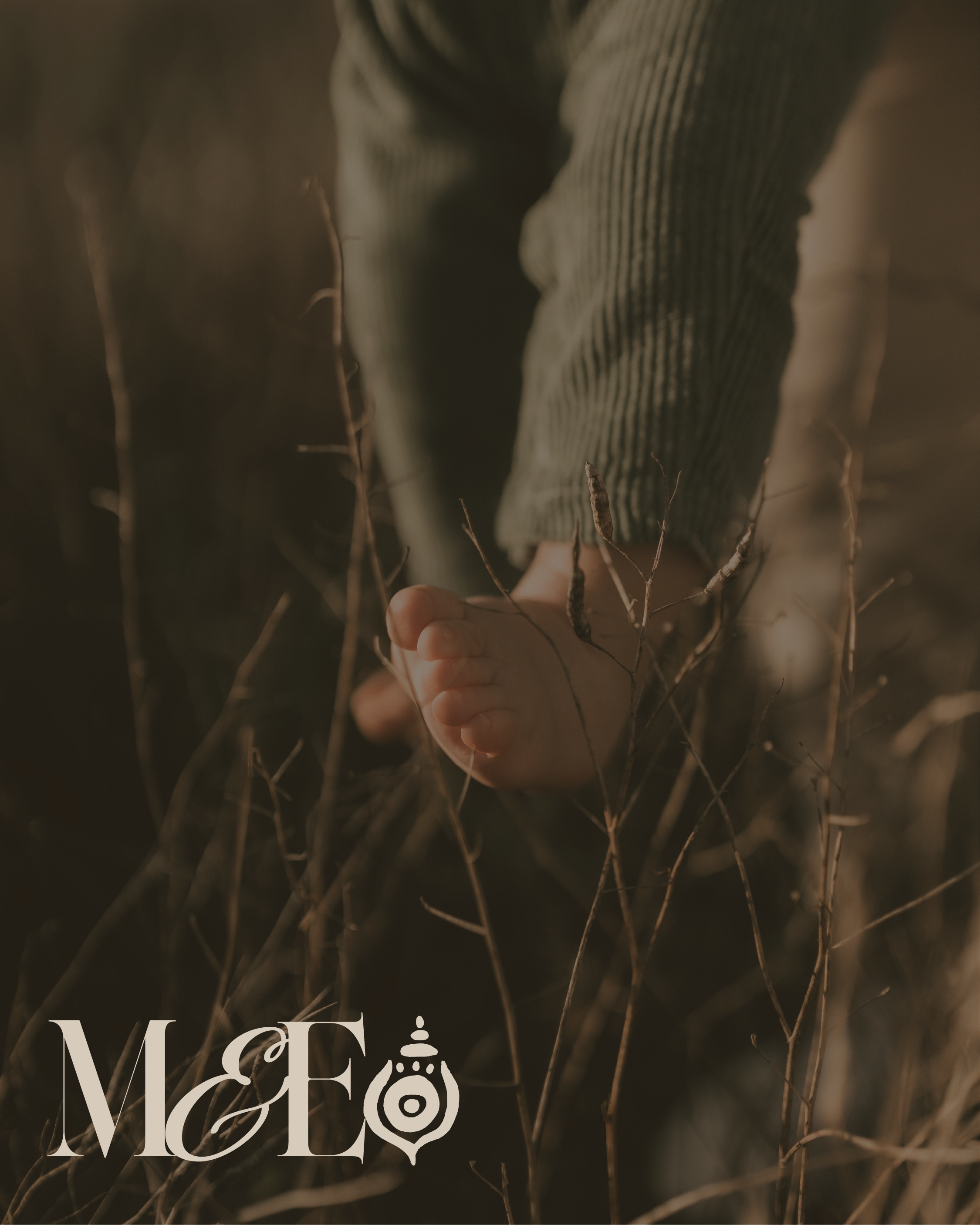
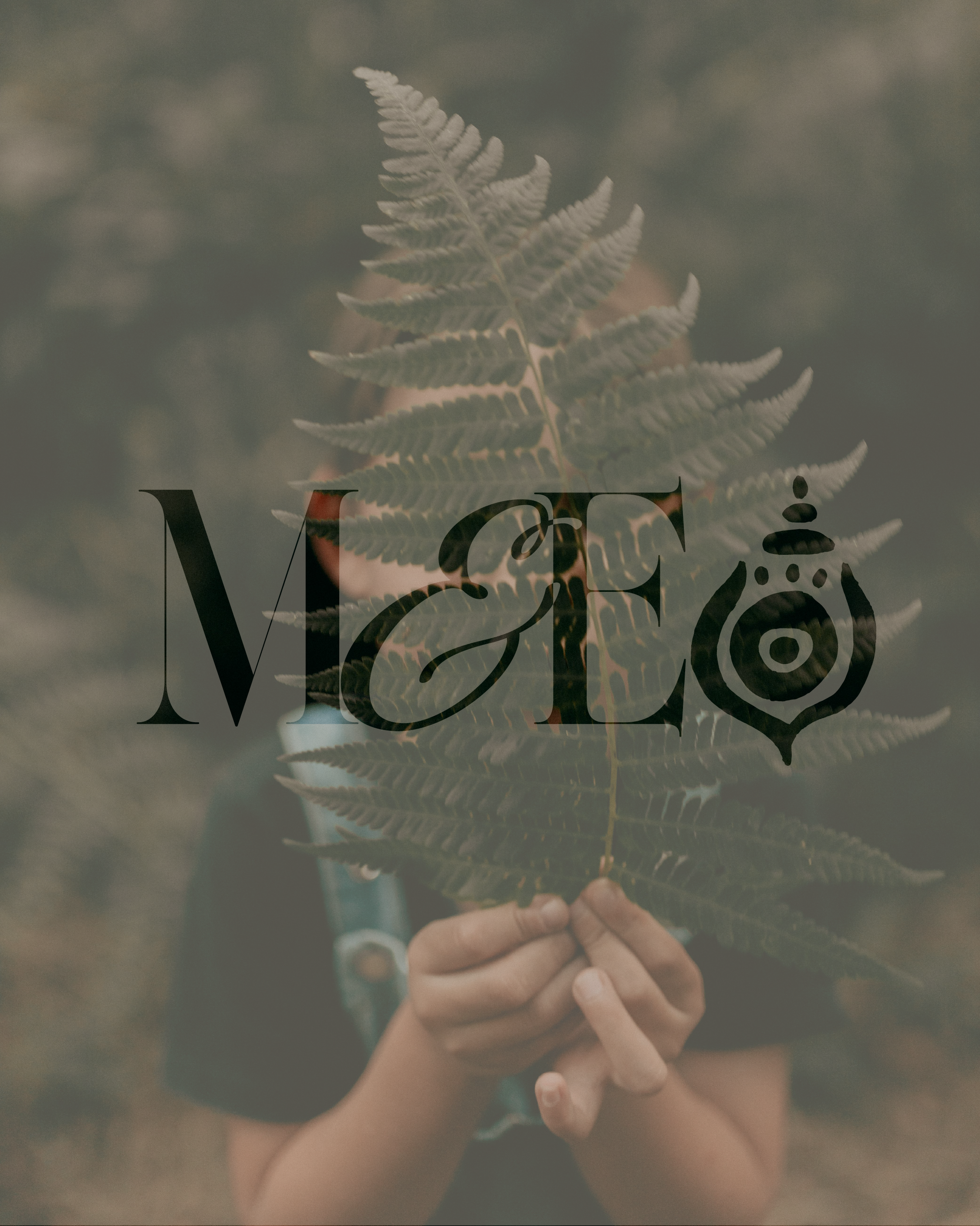
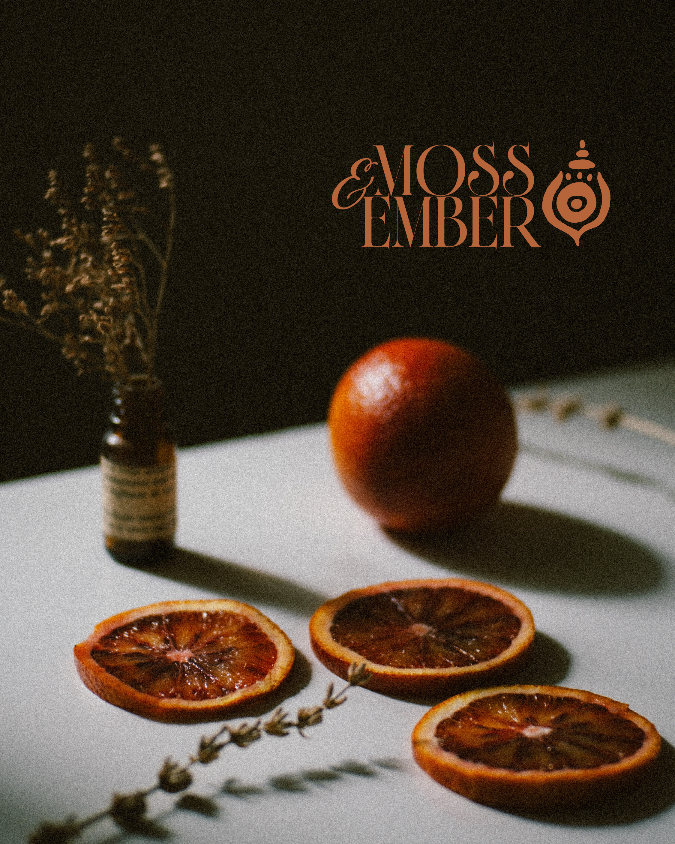
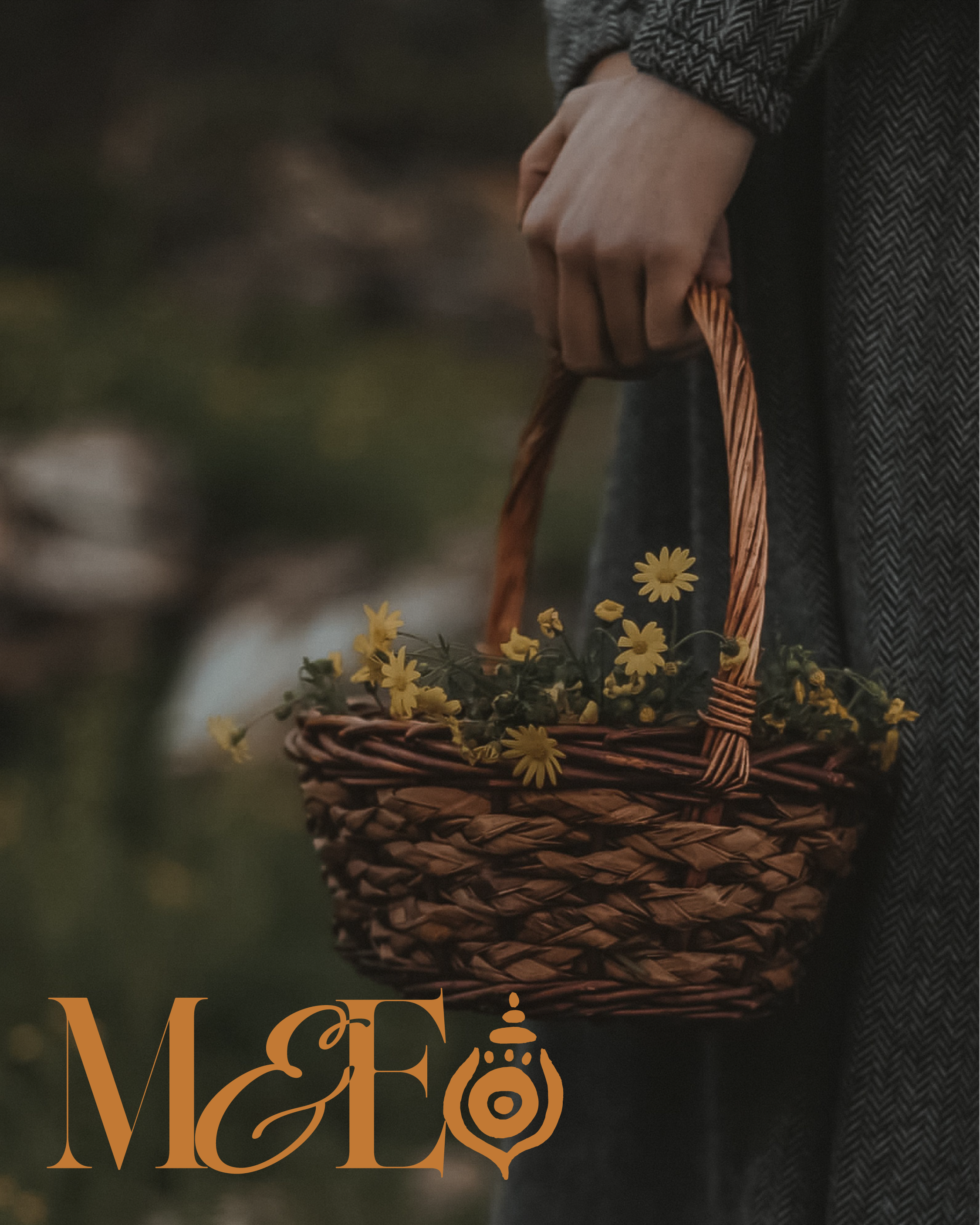
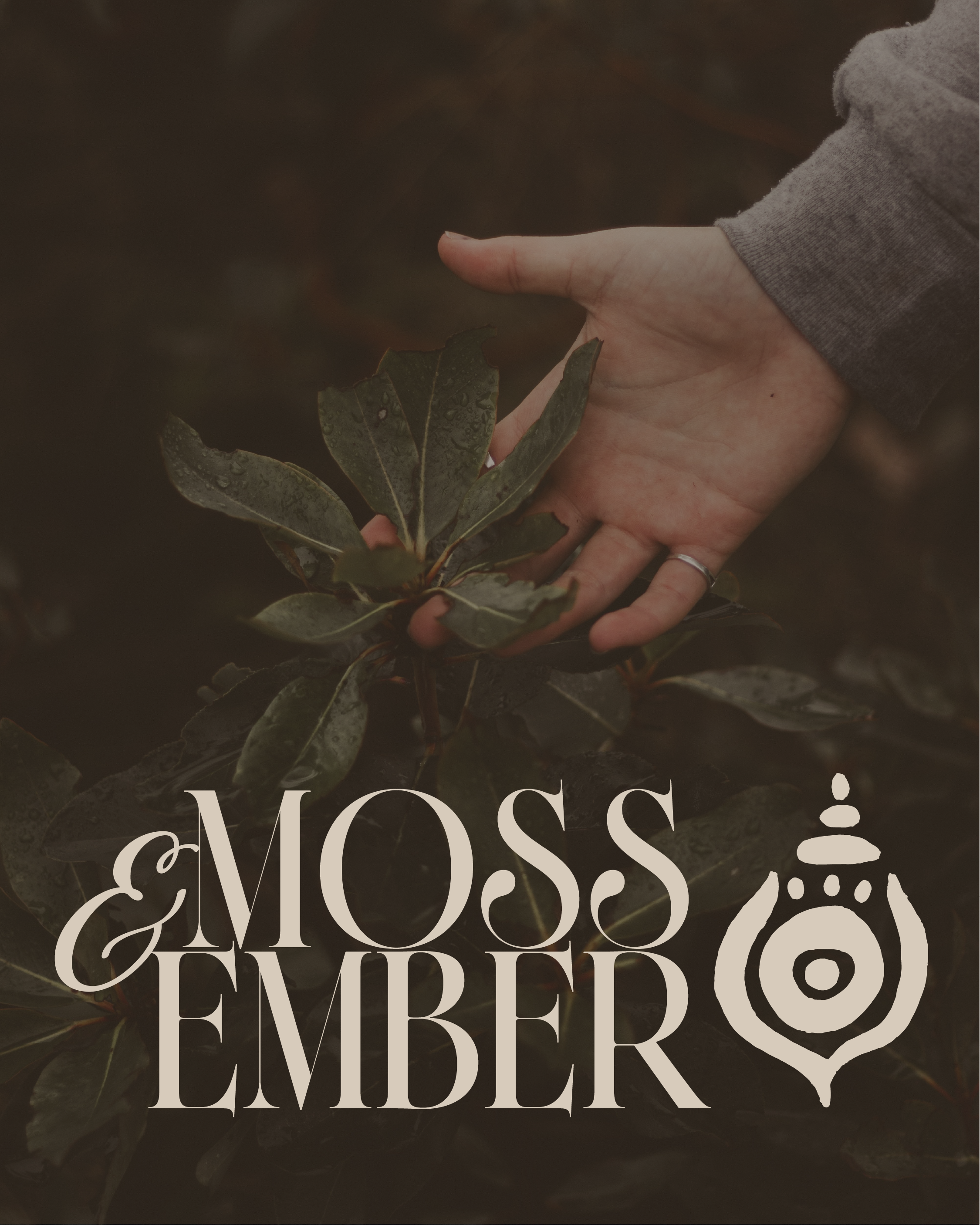
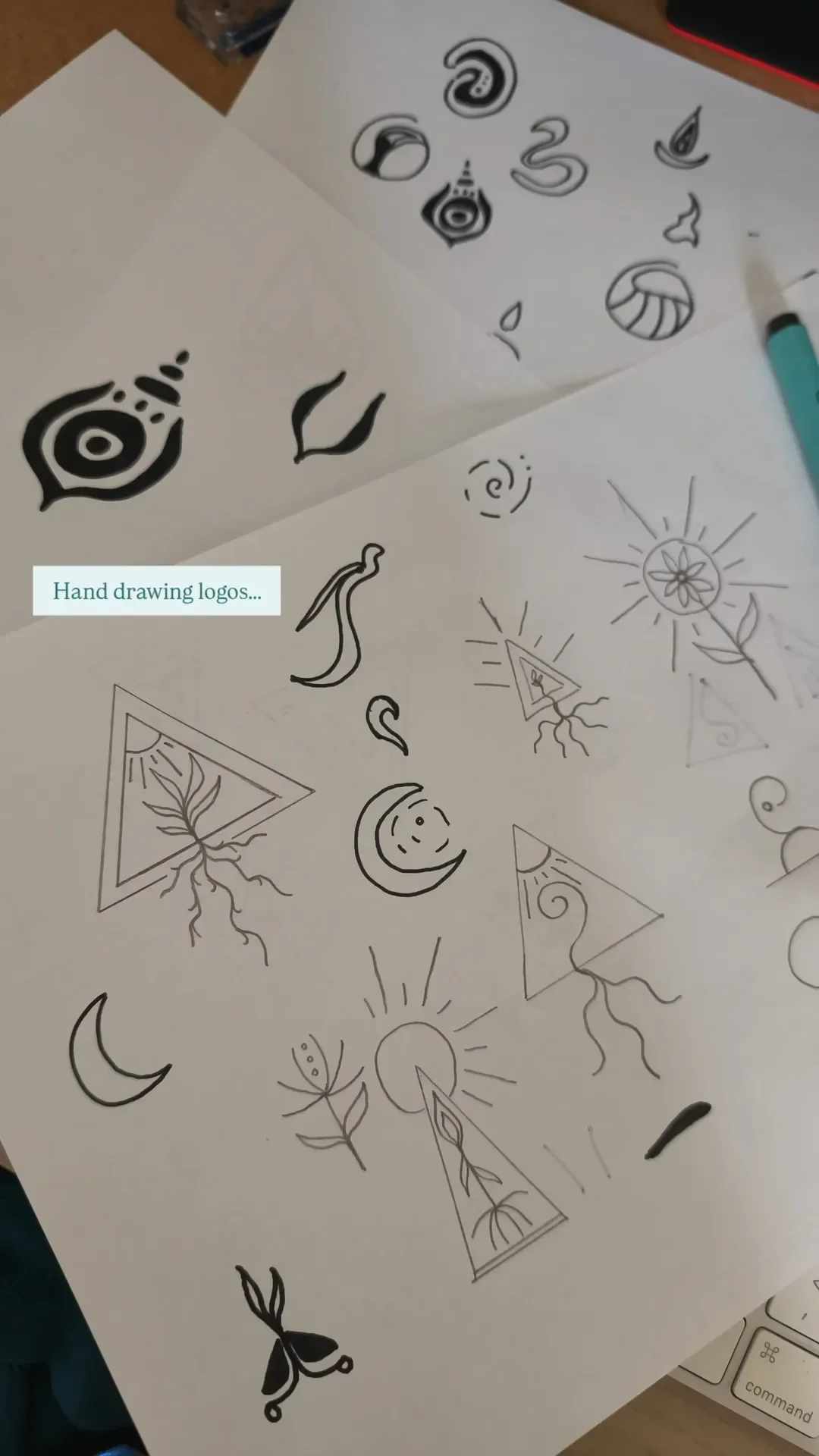
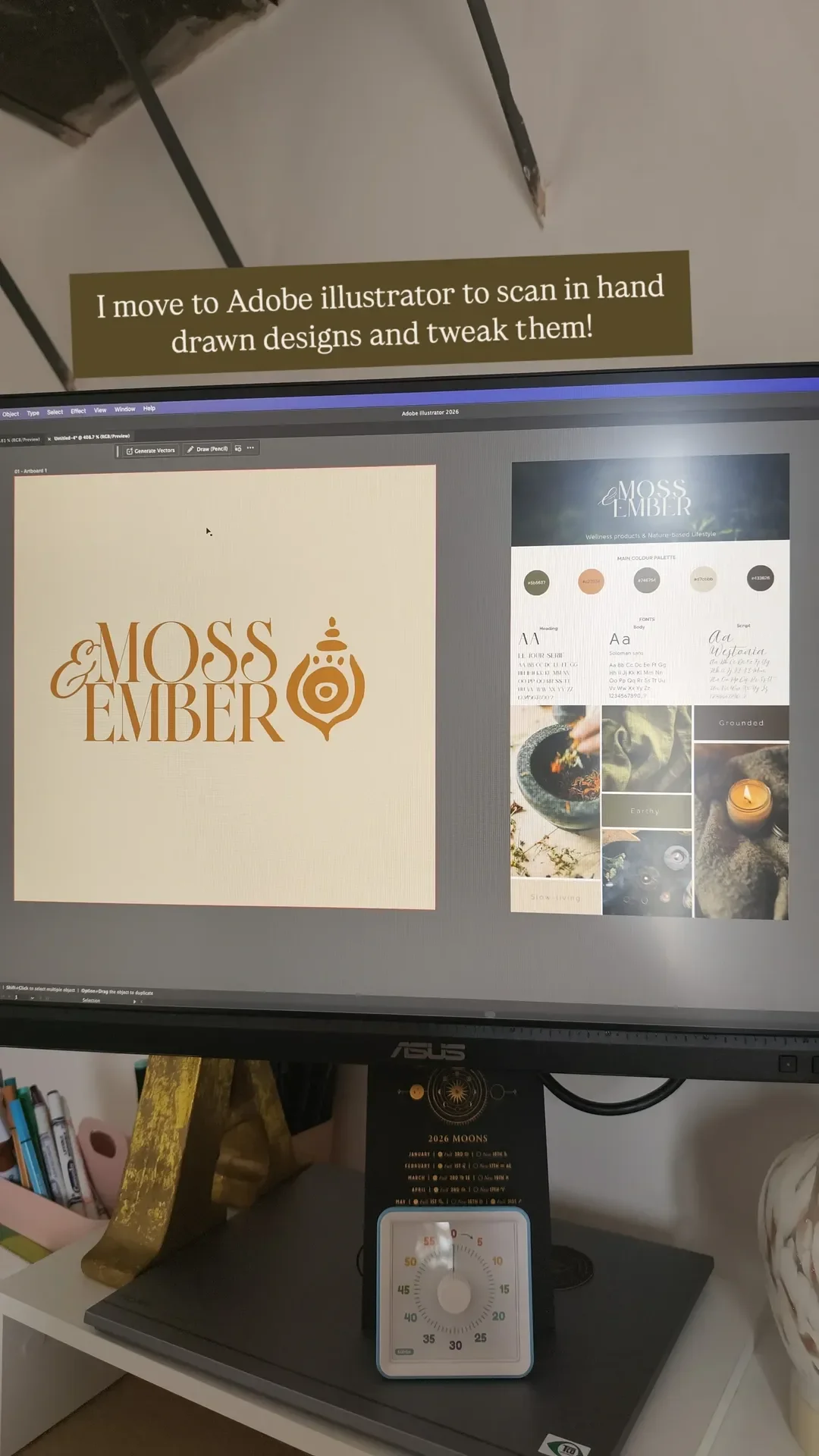
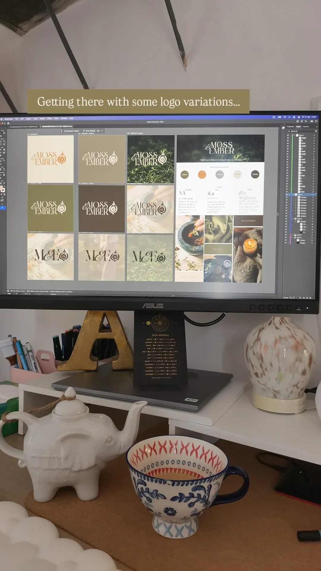
I hand-drew the logo system so it could work in lots of different places. There’s a characterful wordmark that pairs a flowing ampersand with tall display lettering, a refined M&E monogram for smaller spaces, and a custom emblem that sits at the heart of the whole identity.
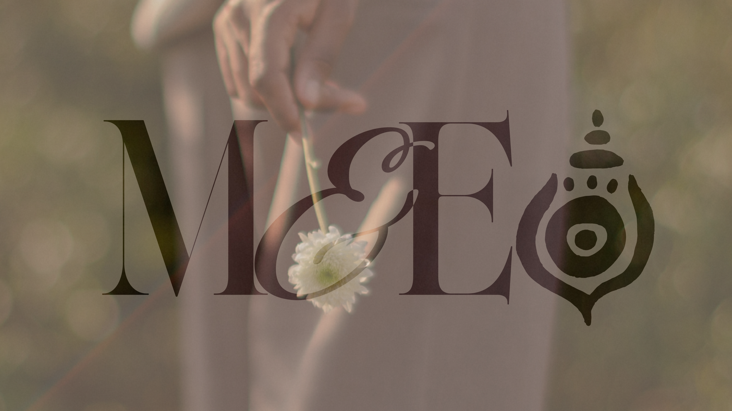
The emblem is an ornate, mandala-inspired vessel, and I wanted it to feel ancient and intentional, like something you’d find pressed into a handmade candle, on a linen tag or on the cover of a beautifully printed booklet. I drew it on paper first and played around with loads of ideas, and the one that felt right combined lots of different elements and symbols, which is also how I came up with the symbols for each value of the brand.
The symbols
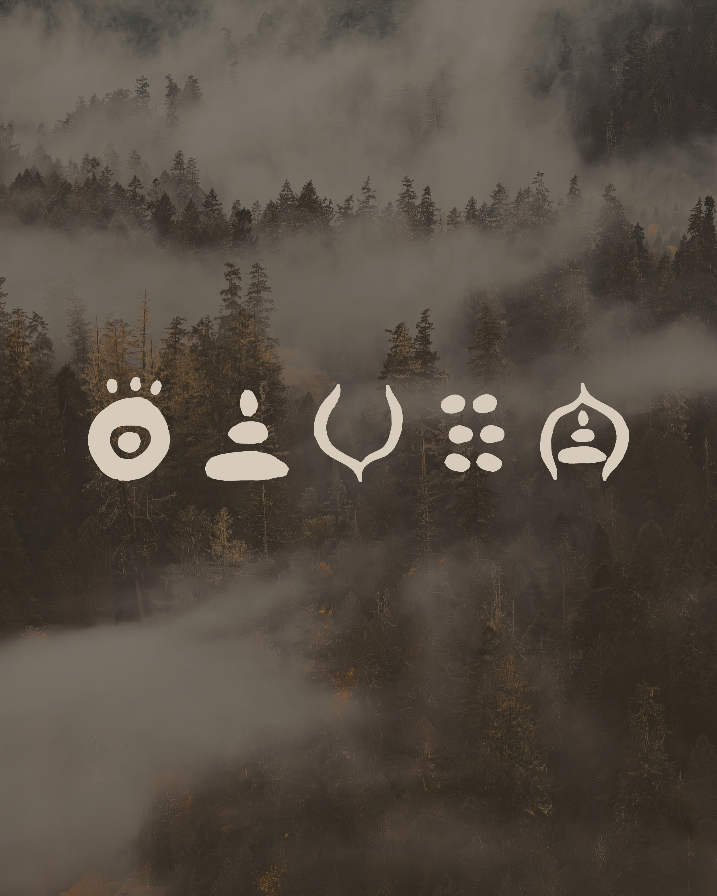
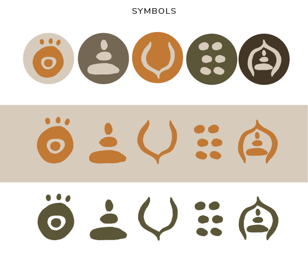
The five symbols are based on wellness imagery and the values behind the brand:
Insight (the third eye): We make choices with intention, so everything we create comes from paying attention to what’s actually needed.
Stillness (the figure in stillness): We believe slowing down is a practice in itself, and our products are made to help people pause and be present in their day.
Holding (the crescent cup): We make things that support and comfort people, and care is built into every detail, from the packaging to the scent.
Community (the cluster): We’re stronger and warmer together, so we celebrate the makers, the suppliers and the people who gather around our rituals.
Sanctuary (the seated person within a shelter): We create lovely calm spaces and little moments that feel safe and welcoming, where people can get cosy and feel like they belong somewhere, anywhere, like their home.
Each symbol works on its own as an icon on the website or a sticker on the side of packaging, and they also sit together as a pattern, so the brand has lots of little details to play with.
Moss & Ember's Colour palette

I named the colours as carefully as I chose them, so the palette reads like a walk through the woods:
Parchment #D7CBBB
Driftwood #746754
Ember #C27934
Moss #5B5637
Bark #433626
I wanted the colours to be warm and rich but also have a bit of luxury without feeling cold and clinical. It is a balance I wanted to get right and that maybe I feel quite a few wellness brands miss when they go for all white, neutrals and minimal.
The fonts
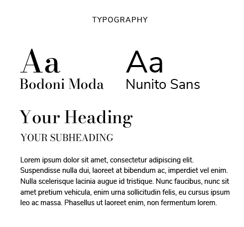
For the typography I wanted a high-contrast editorial serif with loads of personality so went with Bodoni Moda and put Nunito Sans with it for a clean, easy to read body text. I wanted them Moss & Ember to feel at home on across all types of packaging for homeware, as well as a website or a lookbook printed out.
What Moss & Ember taught me
I really wanted to push past the usual limits of how a logo is presented, where the horizontal lockup has to be perfect and the mark sits on the left, neatly aligned with the wordmark, so I put mine on the right instead. I learnt that a logo doesn’t need to be perfect, especially in the world of AI now, and I wanted to bring a real tension between the hand-drawn element and the elegant wordmark too. What started as a template for a website I was creating turned into a whole brand, and I loved going back to paper and scanning it into Adobe Illustrator instead of reaching for Procreate.
If you run a wellness, holistic or nature-based business and you’d love a brand that feels this grounded, have a look at my Branding page, or start with a free brand audit and I’ll tell you honestly where I’d start.