
MOSS & EMBER - WELLNESS PRODUCTS & NATURE-BASED LIFESTYLE BRAND
A Brand Rooted in Nature, Built to Last
CONCEPT PROJECT
BRAND IDENTITY · CONCEPT PROJECT
A grounded, earthy brand identity for a wellness and nature-based lifestyle concept - built from the ground up. Logo suite, colour palette, typography, brand symbols, and brand guidelines by Wild Mind Studios.
Please note: Moss & Ember is a concept project created to showcase the Wild Mind Studios design process and creative range.
Neon Tide - Project Scope
Project Scope
Logo Suite - Primary wordmark, monogram & custom emblem
Colour Palette - Earthy, nature-led tones with warmth and depth
Typography - Considered pairing for a grounded, premium lifestyle feel
Brand Symbols - Custom icon suite across three colourways
Brand Guidelines - Full usage rules and visual standards
PHASE 1: BRAND STRATEGY & VISUAL DIRECTION
Moss & Ember needed to feel like the brand equivalent of a walk through an ancient forest - warm, considered, and completely unhurried.
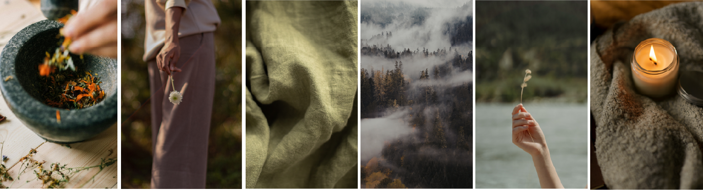
The creative direction drew from the natural world in its most grounded form: rich bark tones, muted mossy greens, the warm amber glow of ember light. The mood we were building was slow wellness - a brand that felt nourishing before a single product was even seen.
PHASE 2: LOGO SUITE & BRAND IDENTITY
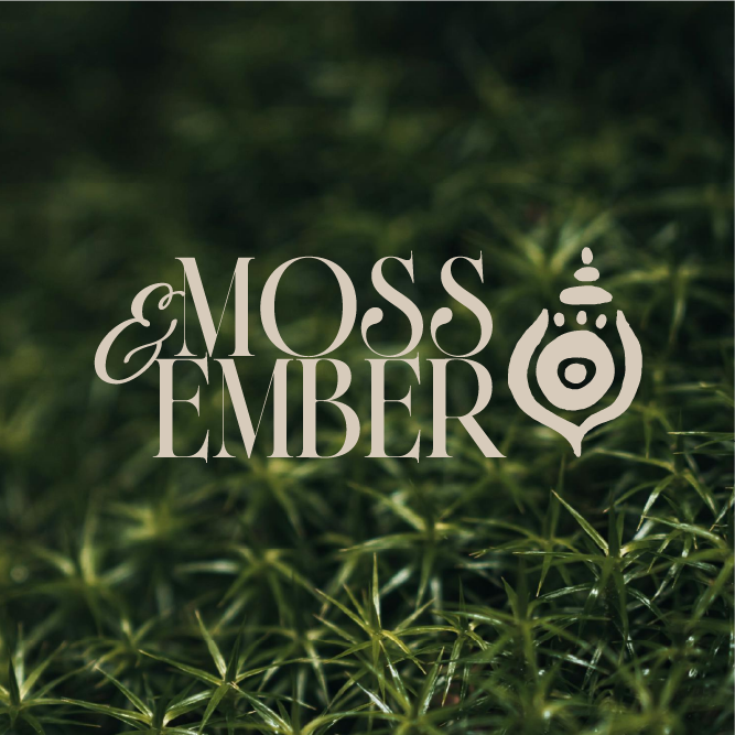
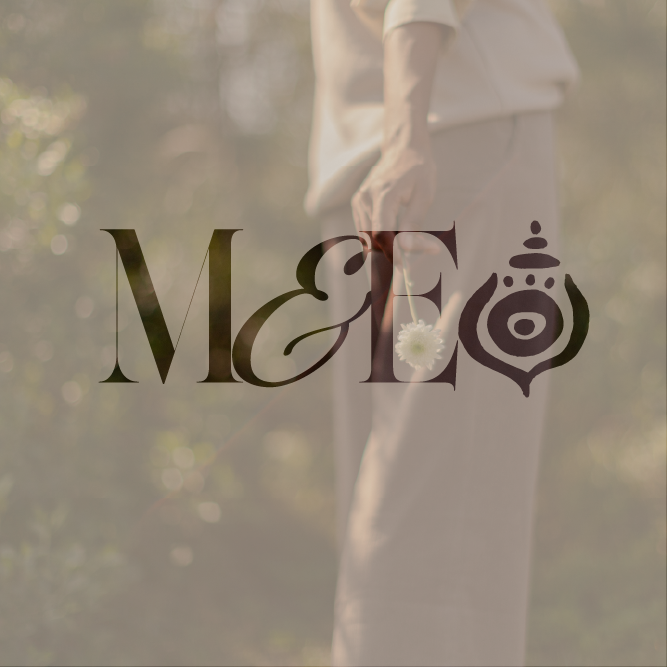
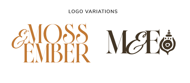
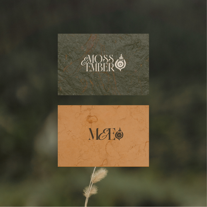
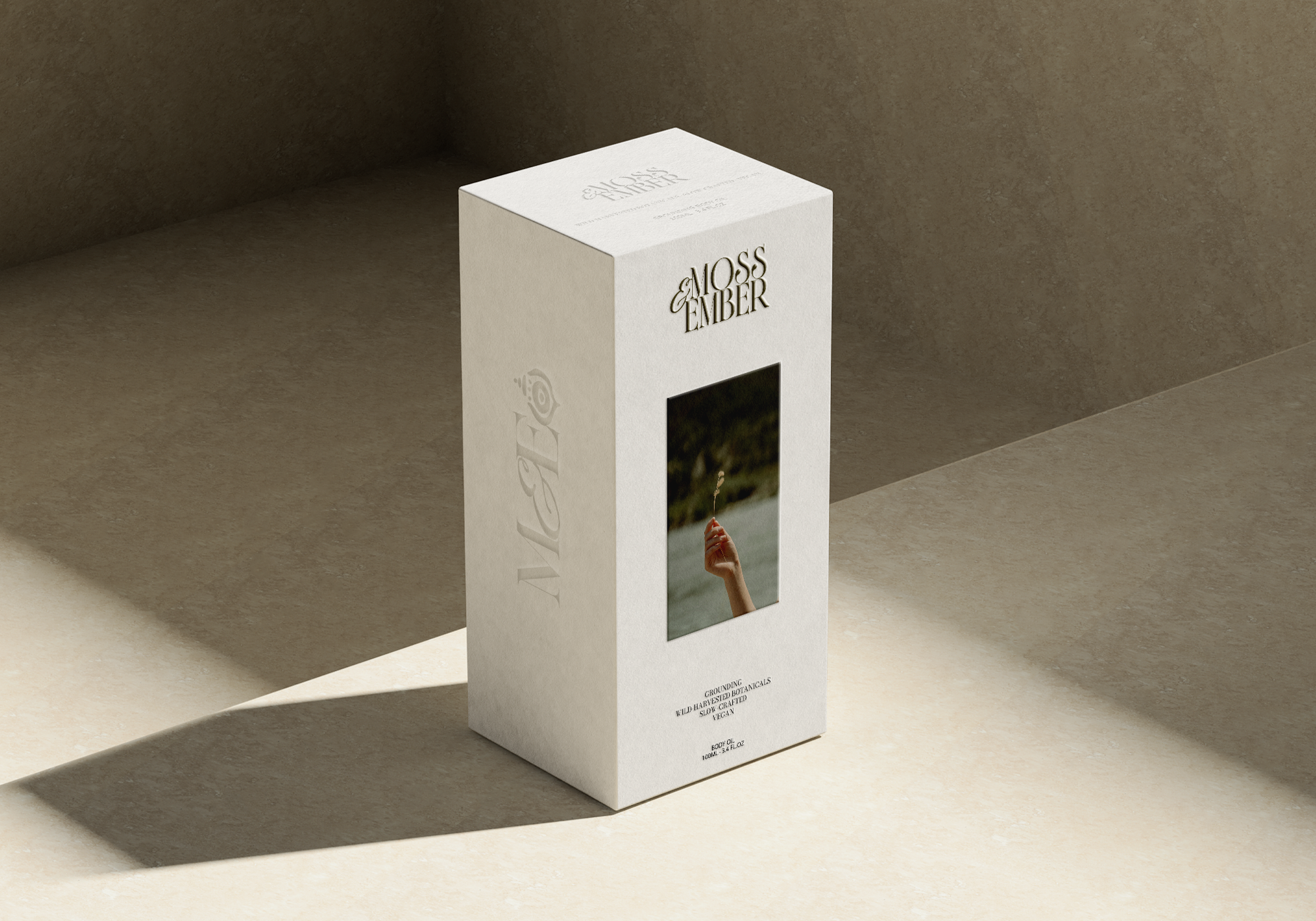
The logo system was hand drawn with real flexibility in mind - a bold, characterful wordmark pairing an ampersand-led script with strong display lettering, a refined ME monogram submark, and a custom emblem that sits at the heart of the whole identity.
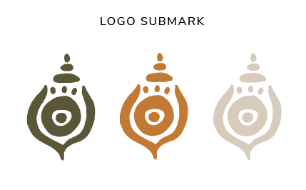
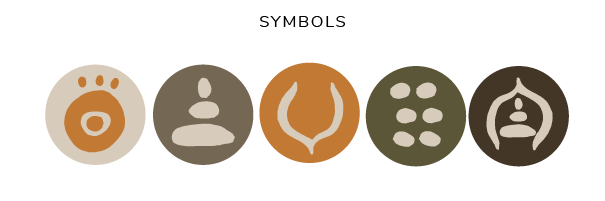
That emblem - an ornate, mandala-inspired vessel - was designed to feel ancient and intentional, the kind of mark that could belong on a handmade candle, a linen tag, or a beautifully printed brand booklet. Five custom symbols were developed alongside it, drawn from wellness iconography: a third eye, a figure in stillness, a crescent, a cluster, a seated form. Each one works independently or as part of a wider pattern system.
The result is a brand identity with genuine depth - one that rewards close attention.
PHASE 3: COLOUR PALETTE & TYPOGRAPHY
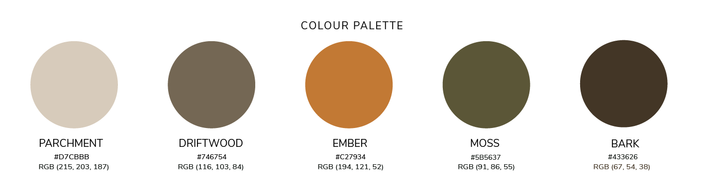
The palette was named as carefully as it was chosen - Parchment, Driftwood, Ember, Moss, and Bark. Five colours that map directly onto the natural world the brand inhabits, with a warmth and richness that feels premium without ever feeling cold.
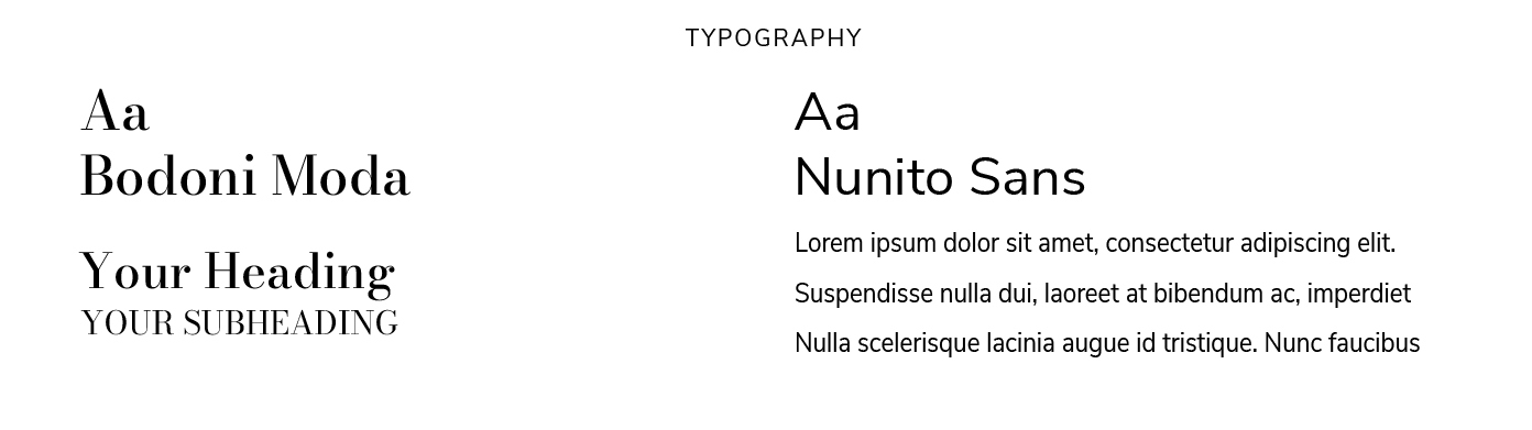
Typography pairs Bodoni Moda - a high-contrast editorial serif with real personality - with Nunito Sans for clean, legible body copy. The combination gives Moss & Ember the range to feel equally at home on a product label, a website, or a printed lookbook.
Ready to build something?
If you're a wellness, lifestyle, or nature-based business ready for a brand that genuinely reflects the quality and intention behind your work - let's talk.
Not sure what your brand needs right now?
Get your free brand audit below.