

NEON TIDE - BRAND IDENTITY FOR A CREATIVE STUDIO COLLECTIVE
Where the Digital Meets the Deep
CONCEPT PROJECT
BRAND IDENTITY · CONCEPT PROJECT
A luminous, editorial brand identity for a digital creative studio collective - built from the ground up. Logo suite, colour palette, typography, brand symbols, and brand guidelines, plus a partial website concept, by Wild Mind Studios.
Please note: Neon Tide is a concept project created to showcase the Wild Mind Studios design process and creative range.
Neon Tide
Project Scope
Logo Suite - Primary mark, monogram & supporting symbols
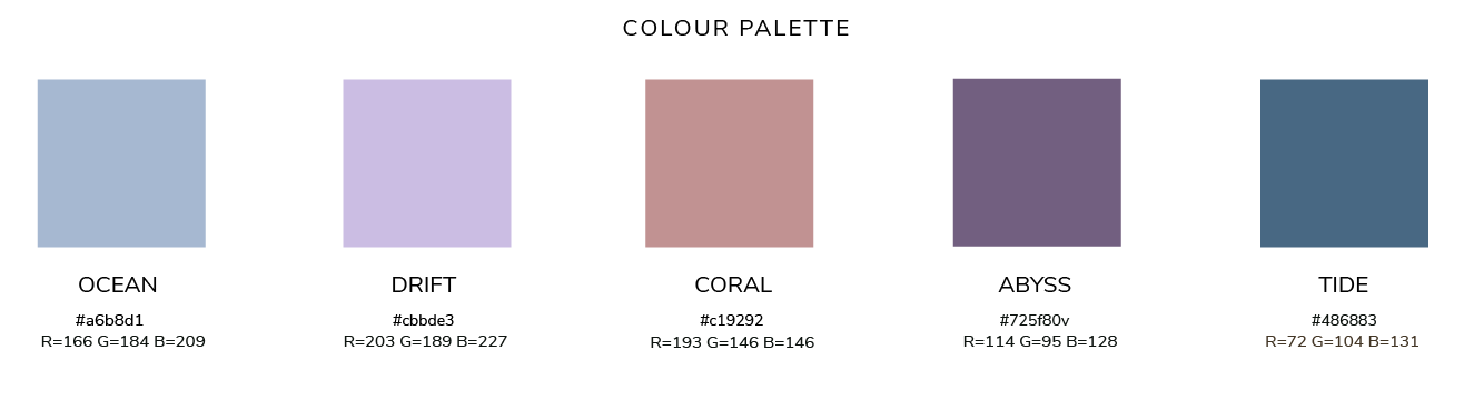
Colour Palette - Luminous, oceanic tones with editorial depth
Typography - Considered type pairing for a premium creative studio feel
Brand Symbols - Custom graphic elements for use across touchpoints
Brand Guidelines - Full usage rules and visual standards
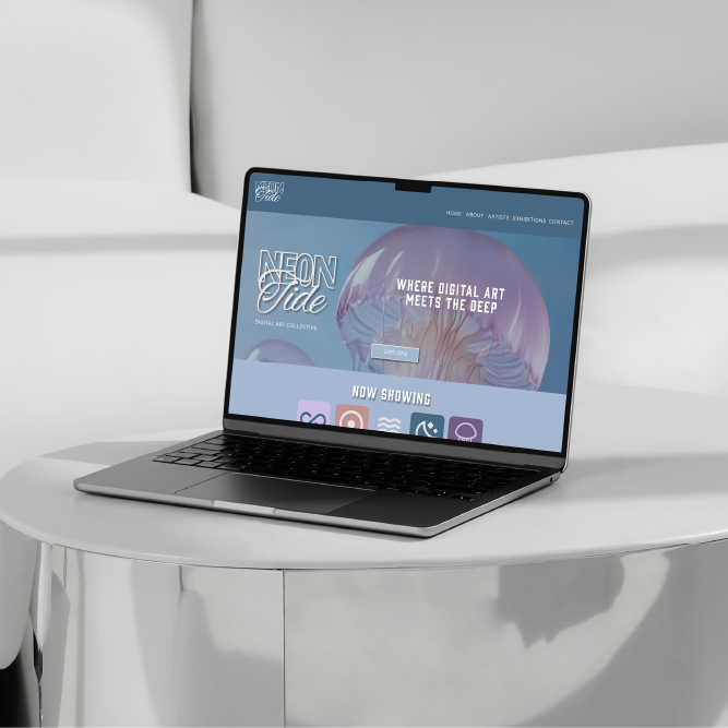
Website Concept - Partial homepage design and layout direction
PHASE 1: BRAND STRATEGY & VISUAL DIRECTION
Neon Tide needed to feel like nothing else in the digital art space - luminous, otherworldly, and unmistakably its own thing.
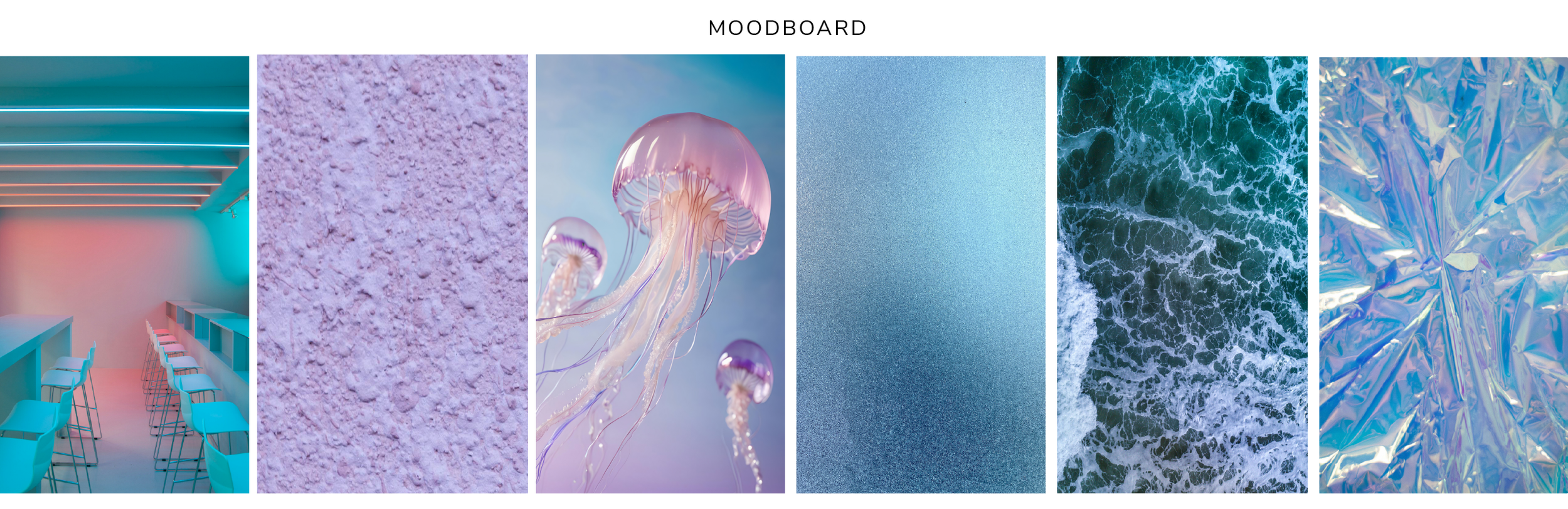
The creative direction drew inspiration from the ocean's deeper, stranger beauty - bioluminescent creatures, shifting light through water, the tension between the neon and the natural. The mood we were building towards was digital surrealism meets coastal wonder - a world that felt genuinely immersive before a single piece of art was even shown.
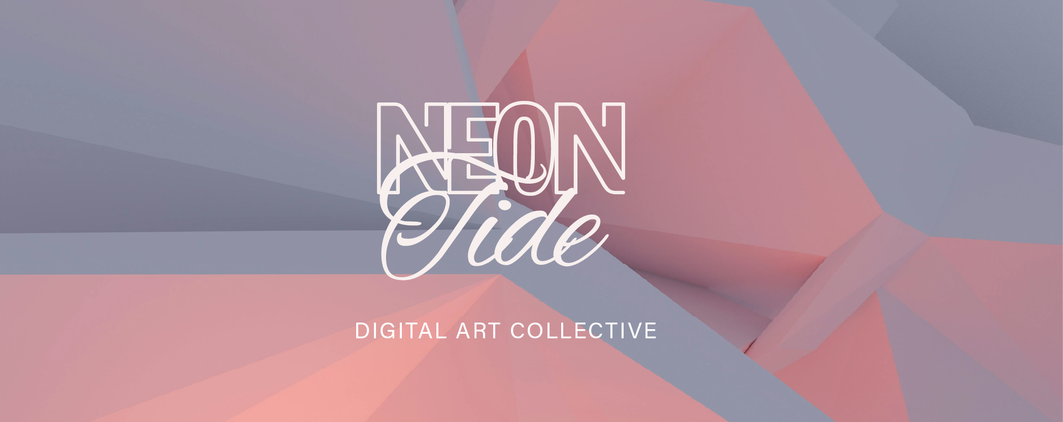
PHASE 2: LOGO SUITE & BRAND IDENTITY
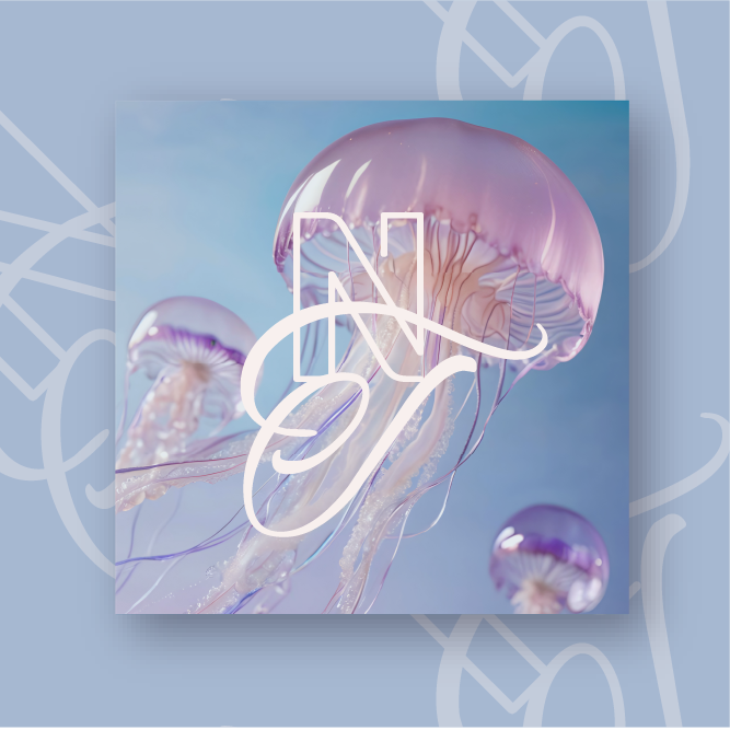
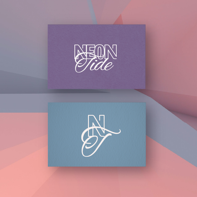
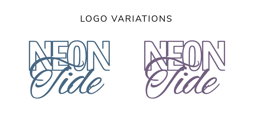
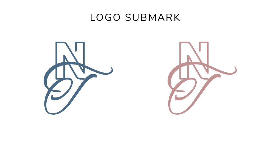
The logo system was built for flexibility - a full wordmark combining a bold display font with a flowing script, plus an NT monogram submark in both teal and coral colourways, giving the brand range across every possible touchpoint.
Five custom symbols were developed to sit alongside the identity - infinity, waves, a crescent eye, a jellyfish, and a radial mark - each one drawn from the oceanic world of the brand and designed to work as standalone graphic elements, pattern components, or icon sets.
The result is a brand system with genuine depth. Every element earns its place.
PHASE 3: COLOUR PALETTE & TYPOGRAPHY
The palette was named as carefully as it was chosen - Ocean, Drift, Coral, Abyss, and Tide. Five colours that tell the whole story without a single word of explanation. Soft periwinkle blues and mauves sit alongside a warm coral and deep slate, creating a palette that feels both contemporary and timeless.
Typography pairs Gin - a bold, characterful display face - with Acumin Pro for clean body copy, and a flowing script for accent use. The combination gives Neon Tide the editorial range to feel at home in a gallery, a website, or a brand campaign.
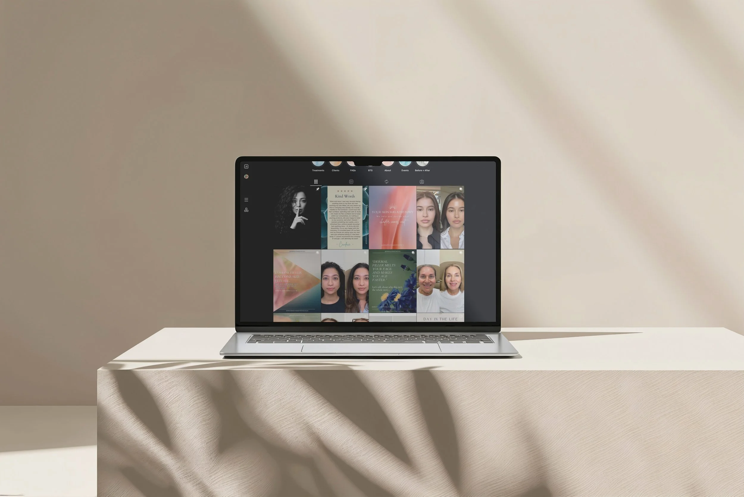
Phase 4: Social Media Strategy & Content Creation
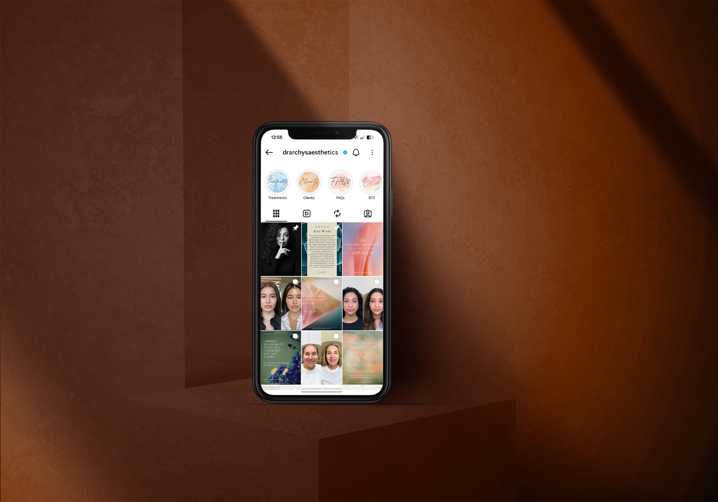
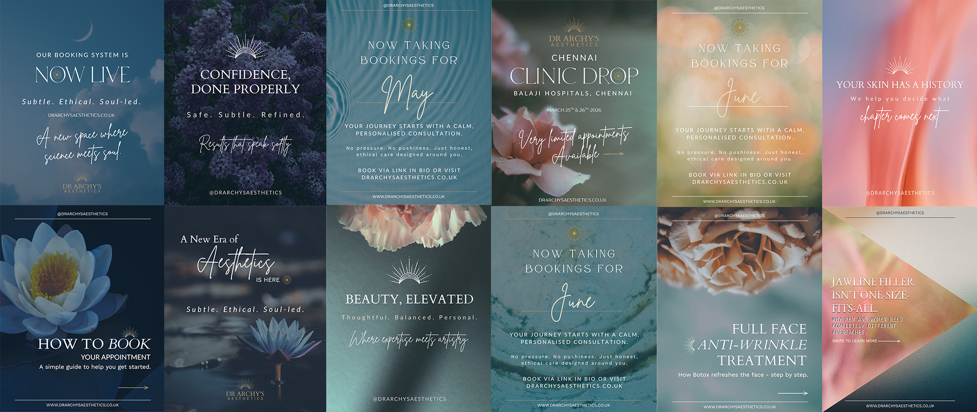
A brand only truly comes to life when it meets its audience - and that's exactly what Phase 4 was about.
We designed a strategic social media launch to introduce Dr Archy's Aesthetics to the world with confidence and consistency. A full library of branded Instagram templates, educational carousels, and high-impact launch graphics ensured the brand translated beautifully from website to feed - nothing generic, nothing off-brand, nothing that looked like everyone else in the space.
Beyond the launch, we continue to support the brand with ongoing monthly content - translating complex medical aesthetics topics into visual stories that are engaging, accessible, and always ethically considered.
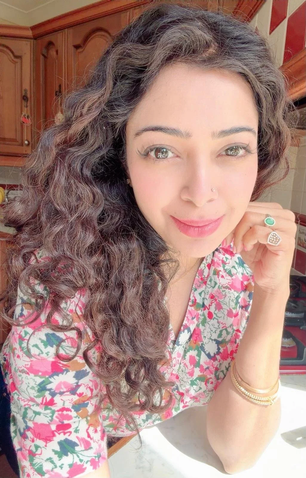
Dr. Archy, Founder of Archy's Aesthetics
-
![Portrait of Dr. Archy of Archy's Aesthetics, a medical professional who partnered with Wild Mind Studios for a premium Squarespace website and brand design.]()
It has been an amazing experience!
“Working with Amie on my business website has been an amazing experience. She has this rare ability to balance creativity with logic, bringing ideas to life in a way that not only looks beautiful but also works perfectly for my business needs.
Her sense of colour and style is exceptional — everything she created felt aligned with my brand and vision. What stood out the most was how much time she took to understand me as a person before even starting the design process. That personal touch made all the difference.
Amie is incredibly approachable, friendly, and patient. She never rushes the process and makes you feel completely at ease every step of the way. I couldn’t have asked for a better person to bring my website to life.”
~ Archy, Dr Archy’s Aesthetics ~
Ready to build something?
If you're a wellness, beauty, or creative business ready for a brand and website that genuinely reflects the quality of your work - let's talk.
Not sure which package is right for you? Get your free brand audit below.