

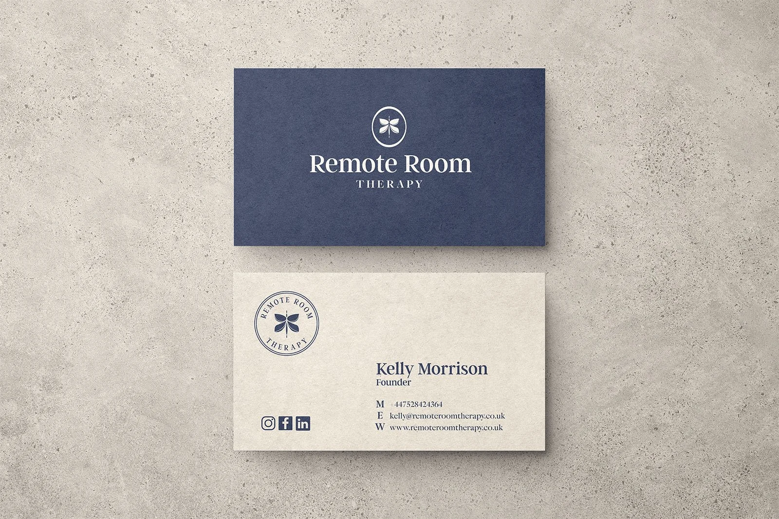
Remote Room Therapy,
honest, human, unhurried
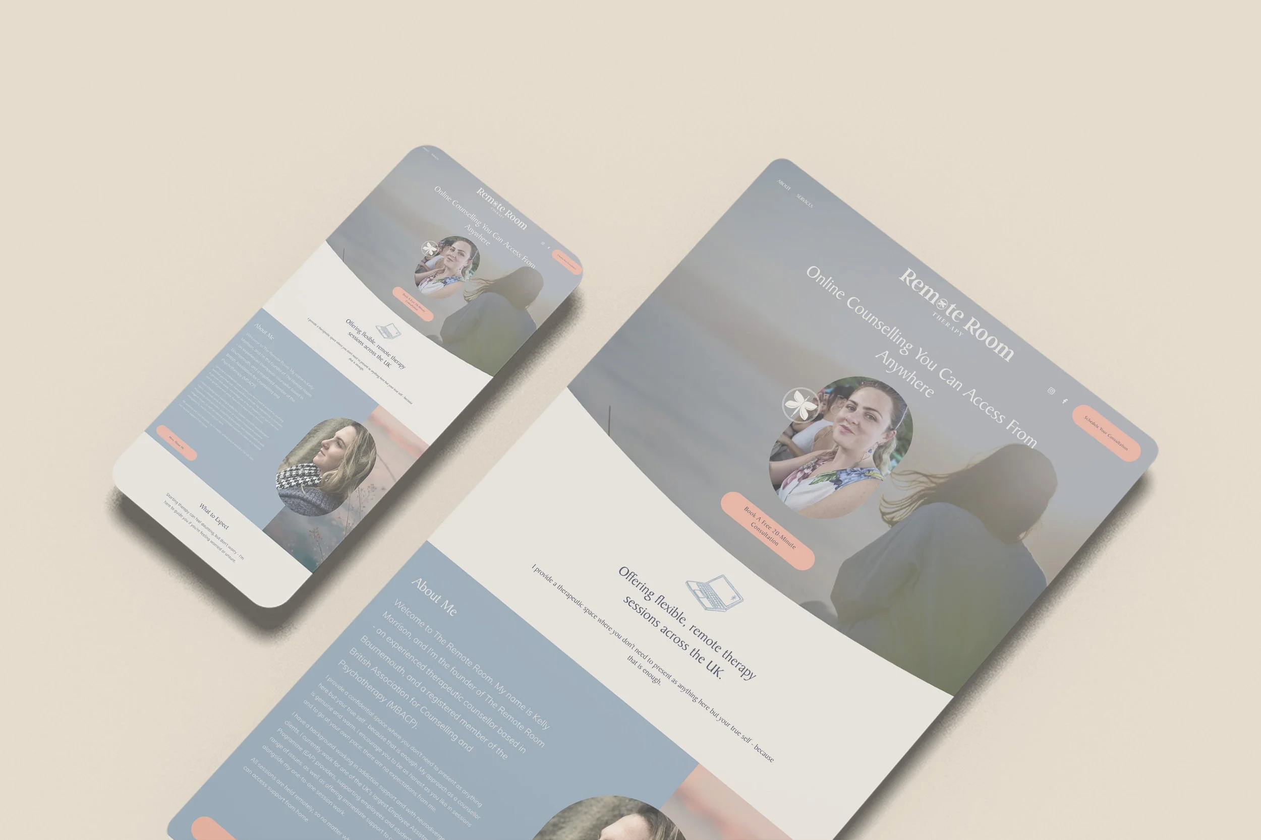
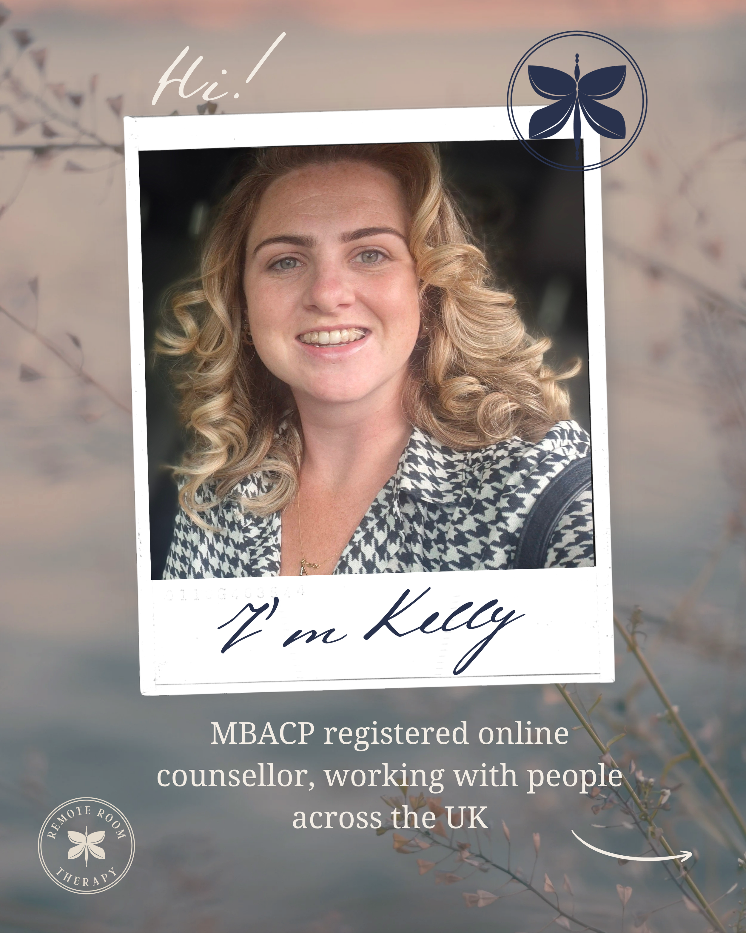
Remote Room Therapy is an online counselling practice set up by Kelly, a counsellor working with clients across the UK, many of whom mask or hold themselves back in the rest of their lives. She wanted a brand that felt genuine, human and no-nonsense, somewhere people could be completely honest without feeling judged, and she was very clear about what she didn’t want, which was clinical jargon, anything posh and the usual therapy clichés.
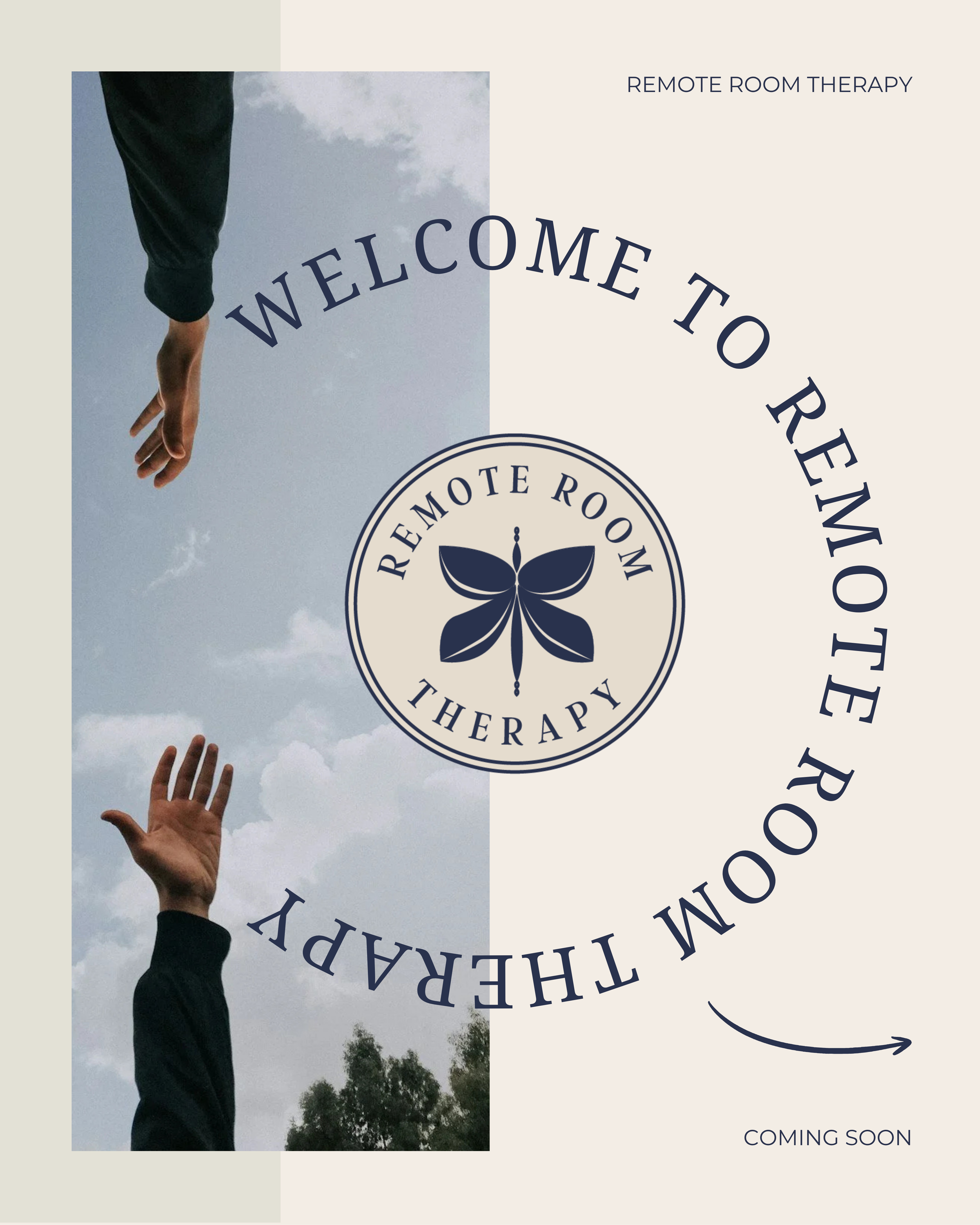
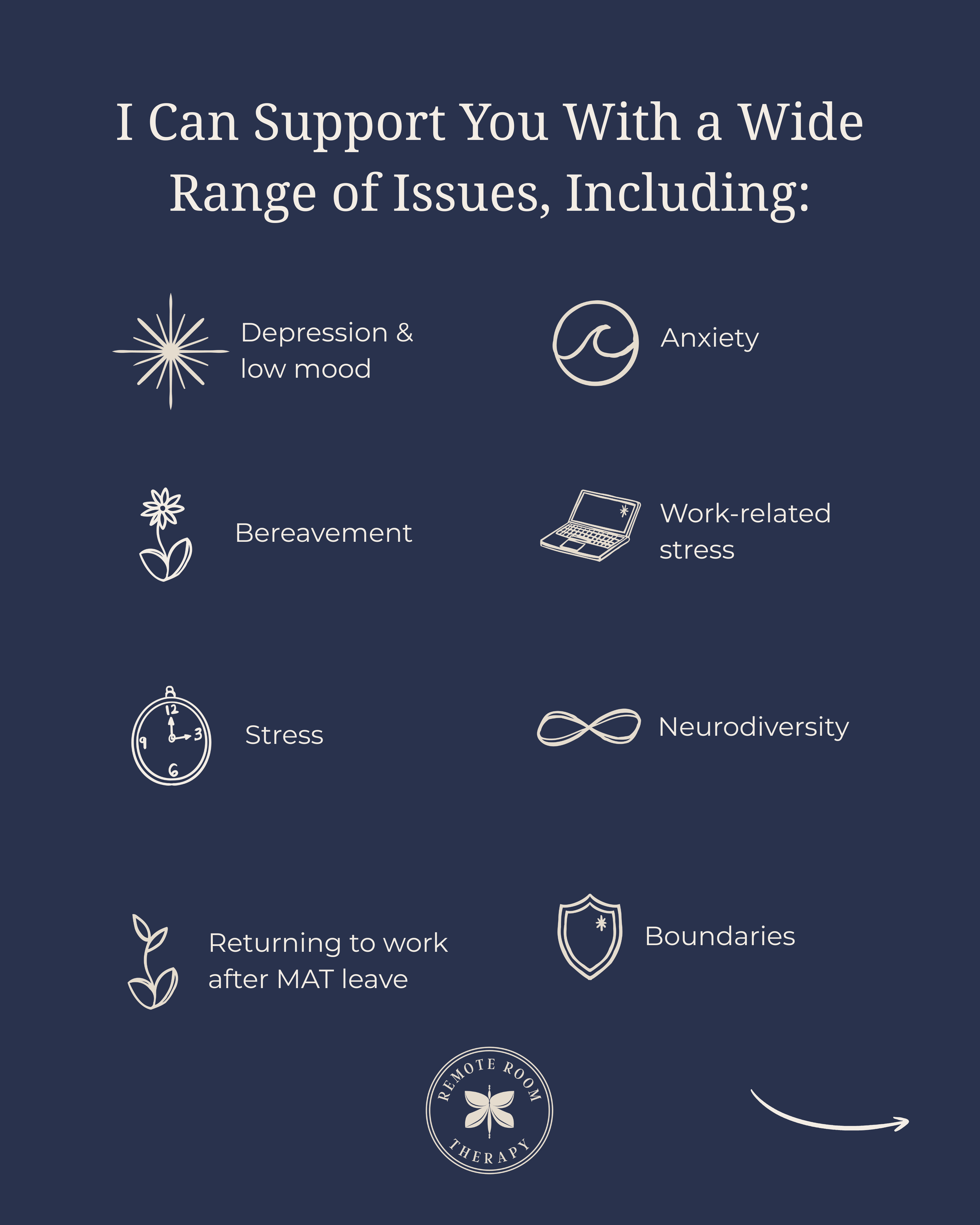
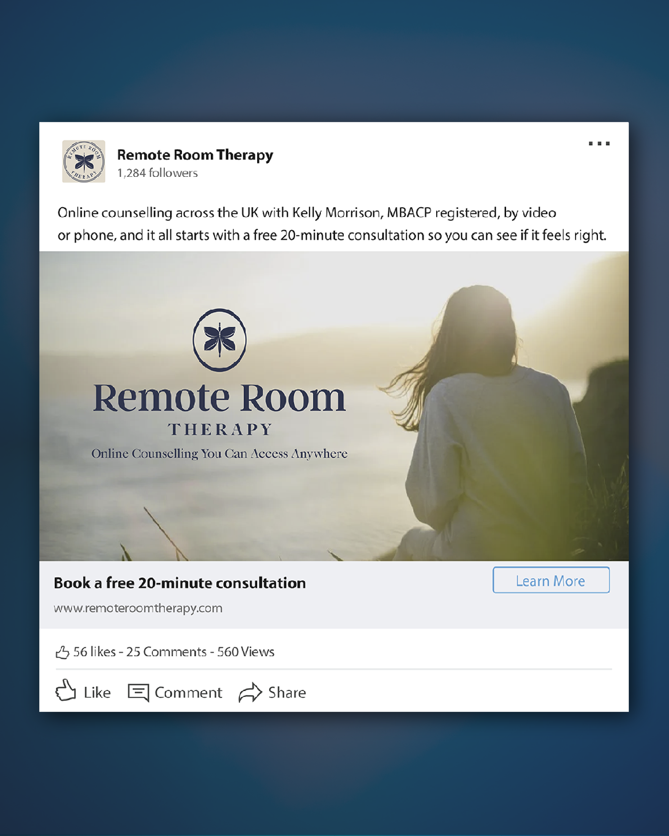
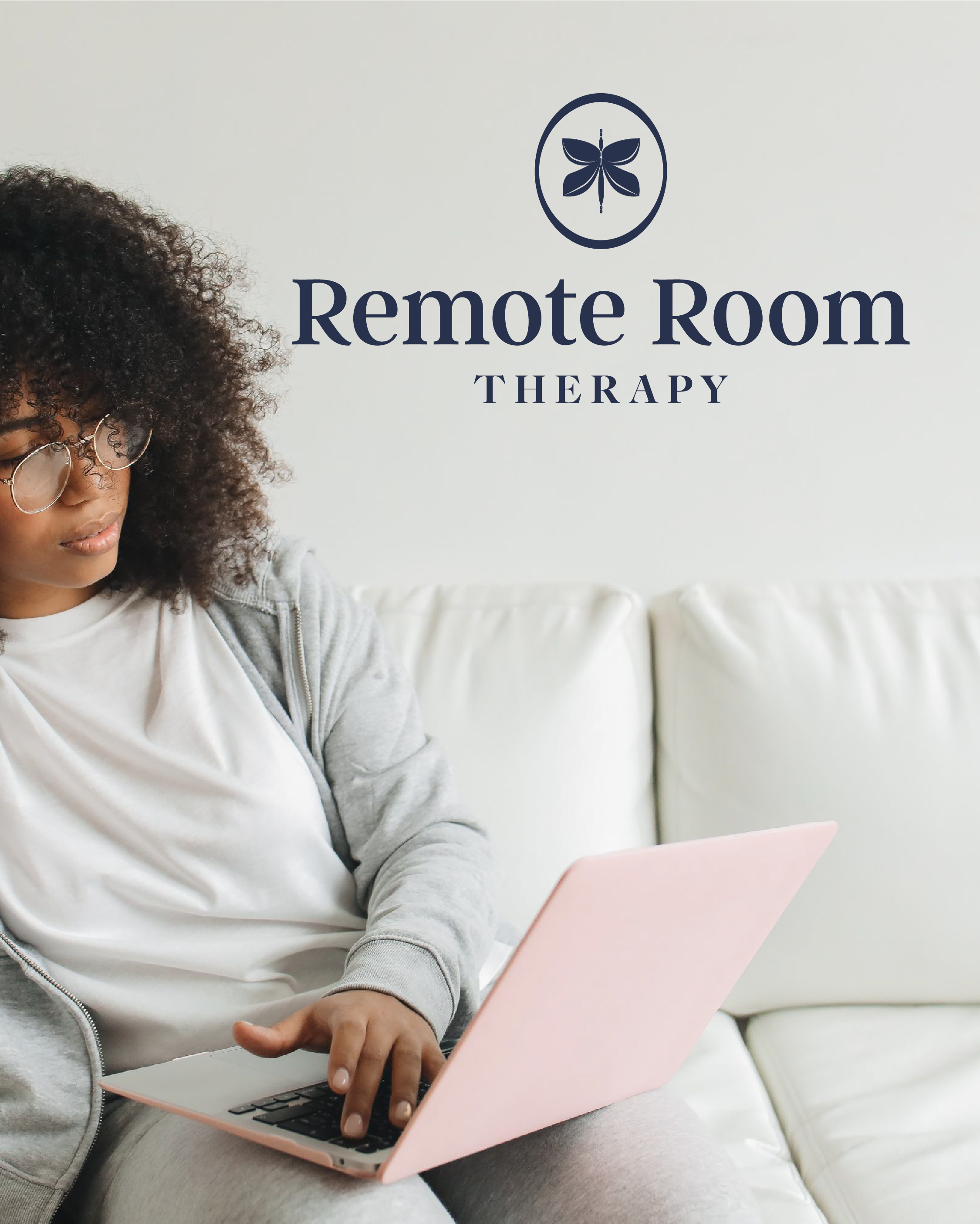
The identity is built around a butterfly emblem, which tucks into the “o” of the wordmark and appears on its own as a circular badge and a small submark. The palette of deep navy, slate blue, warm sand and soft peach feels calm and warm without being fluffy, and I carried it through to a set of hand-drawn icons, business cards, client forms, a LinkedIn banner and full brand guidelines.
SERVICES
Brand Strategy, Logo Suite, Icons, PrintSTYLE
Calm, warm and unpretentiousINDUSTRY
Online counselling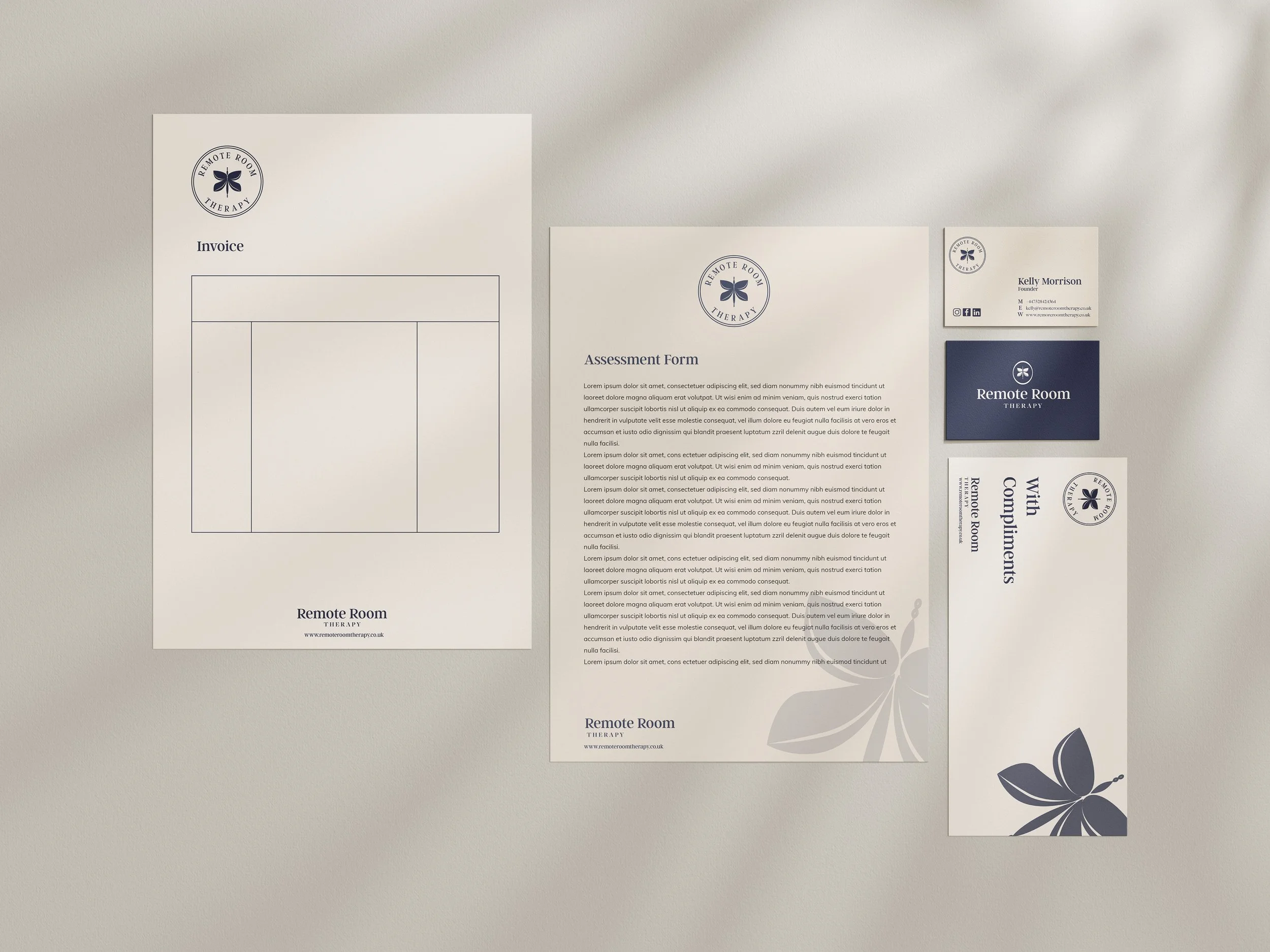
Ready to build something,
that actually feels like you
Have a look at how I work, explore the services or just get in touch. No pressure and no hard sell, just a proper conversation about where you’re at and what might help.
Not sure where to start? I’ll look over your brand for free and tell you what I’d change.